Purpose
In this tutorial, you will learn how to build, format, and customize Oracle Business Intelligence (BI) analyses and how to create and update dashboards by utilizing these analyses. This tutorial is based on OBI EE 11.1.1.6.2BP1 release.Time to Complete
Approximately 2 hoursOverview
Oracle BI is a comprehensive collection of enterprise business intelligence functionality that provides the full range of business intelligence capabilities, including dashboards, full ad hoc, proactive intelligence and alerts, and so on. Typically, organizations track and store large amounts of data about products, customers, prices, contacts, activities, assets, opportunities, employees, and other elements. This data is often spread across multiple databases in different locations with different versions of database software.After the data has been ordered and analyzed, it can provide an organization with the metrics to measure the state of its business. This data can also present key indicators of changes in market trends and in employee, customer, and partner behavior. Oracle BI helps you obtain, view, and analyze your data to achieve these goals.
In this tutorial, you will learn how to create analyses, add graphs, work with pivot tables, format the analyses and graphs, create column and view selectors, work with views, create a dashboard, and add user interactivity and dynamic content to enhance the user experience. You create analyses and work with views including graphs, pivot tables, and narratives.
This tutorial includes the new enhancements that make the application more flexible and highly performing (Housekeeping changes for UI, Client Installer, Right Click Interactions, Sorting Measures, View enhancements, Hierarchy additions, Prompt Enhancements, and so on.) You will then create selectors to drive interactivity in your analyses, and build a custom dashboard that contains the newly created analyses and views. Finally, you will create flexible dashboard prompts to filter your dashboard and populate variables.
Software and Hardware Requirements
The following is a list of software requirements:- Oracle BI EE 11.1.1.6.2 BP1 or later must be installed.
- Windows 2000 or later must be installed.
Prerequisites
Before starting this tutorial, you should:- Have the proper permissions for configuring dashboards on your company's system
- Ensure that the Sample Sales repository and data files are installed. You can download the Sample Sales files from here.
Beginning the Analytic Process
In this topic, you will learn how to access Oracle BI EE to create an analysis.The new enhancements for the version 11.1.1.6.0- Favorites Menu, global header links, BI client installer, and sorting are covered under this topic.
Logging In
This topic will cover the general navigation to start with the analytic process.To log into Oracle BI EE and begin creating an analysis, perform the following steps:
| 1 . | Navigate to the Oracle Business Intelligence Sign In page and sign in. In a browser window, enter http://localhost:7001/analytics. The Oracle Business Intelligence Sign In page is displayed. Enter your User ID and Password and click Sign In. Observe that you can select Accessibility Mode. 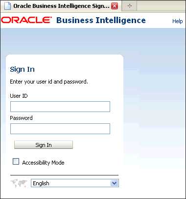 When you sign in, the Home page is displayed. |
|---|---|
| 2 . | The Home page is a task-oriented,
centralized workspace combined with a global header, allowing access
to Oracle BI EE objects, their respective editors, help documentation,
and so on. The Home page contains a global header, a Create New section, a Catalog Management section, a Get Started section with links to additional help and BI tools, a Recent section displaying the recently viewed or created analyses or dashboards, and a Most Popular section. You can always operate these features from the global header as well. Observe that there is a new link in the global header for the Favorites section. This is a new enhancement. 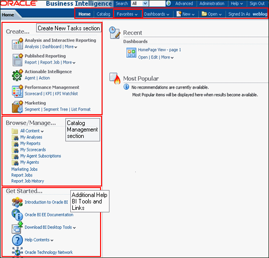 |
Favorites Menu
The current release introduces Favorites, which allows you to bookmark your favorite Catalog objects, such as analyses, dashboards, and reports.You can view your favorites list and open your favorite objects from the global header's Favorites menu. This topic covers how to manage favorite objects.
| 1. | You can add catalog objects to favorites using the following steps: Select an object (analysis or the dashboard) from the catalog. In this example select the analysis Quarterly Revenue. Click the More drop-down list and select the task Add to Favorites. 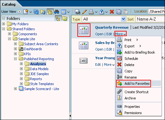 The selected analysis or object is displayed with a gold star symbol on the Home page. 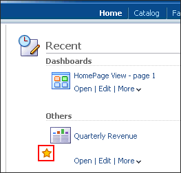 |
|---|---|
| 2. | You can also add the catalog object to favorites by using the tasks pane as shown below. a. Select the object: a report, analysis, or a dashboard. b. Click the Add to Favorites task from the task pane. 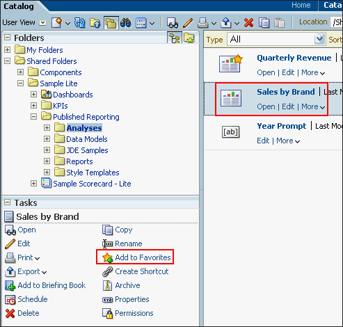 The analysis is displayed as a favorite object on the Home page. |
| 3. | You can also add the object from the viewer window. Open the object (in this example it is an analysis). Click the Favorites menu, and then select Add to Favorites. 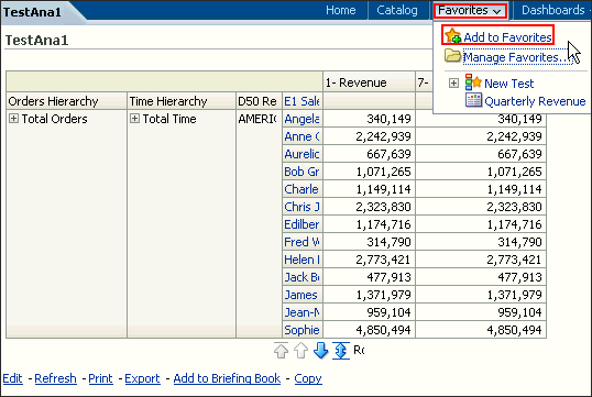 The analysis is displayed as a favorites on the Home page. Observe a star next to the newly added analysis. You can organize these favorites and also delete the objects from the favorites section based on your business requirements. |
Searching the Catalog (Basic Search)
This topic covers the basic search of catalog objects from the global header. Depending upon how your system is configured,you will use the basic search or the fully integrated full-text search to quickly find an object within the catalog.
The basic Catalog search, which is the standard search delivered with Oracle BI EE, gives you the proper privilege
to search for objects from the global header and the Home or Catalog pages.On the Catalog page, you can use the basic Catalog
search to locate an object by searching for its exact name, description, location, and type, only.
You find only those objects for which you have the appropriate permissions. When the desired object is located, you can select the
object to display it for viewing or editing, as your permissions allow.
To conduct a basic search for the catalog objects, perform the following steps:
| 1 . | a. In the global header's Search field, click the drop-down list, and select the object type for which you want to search. 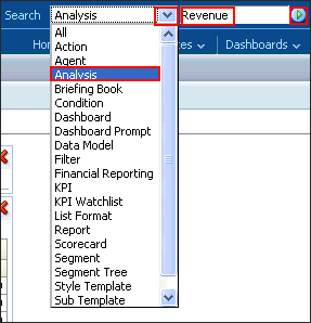 b. Place your cursor in the field next to the Search field and enter part or all of the object's name or description. c. Click the arrow icon to begin the search. |
|---|---|
| 2 . | The Catalog page is displayed with the results that match your search criteria. 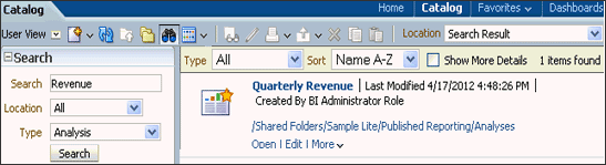 |
BI Client Installer
The Oracle BI Client Tools installer is provided for organizations that install Oracle BI on computers running an AIX, UNIX, orLinux operating system, or that install Oracle BI on computers running 32- or 64-bit Windows operating systems, but want to
use the client tools on other computers. The installer significantly simplifies the installation, uninstallation, and configuration for
Oracle BI client tools. It is supported on computers running 32- or 64-bit Windows operating systems only.
This topic demonstrates how to install BI Client Installer from the Get Started section.
| 1 . | a. From the Home page, under the Get Started section, click Download BI Desktop Tools.  b. Select either the 32- or 64-bit version of Oracle BI Client Installer based on your system configuration. |
|---|---|
| 2 . |
Click Run in the File Download dialog box. The InstallAnywhere
Wizard begins. Follow the subsequent steps that are relevant for the
option you have chosen. 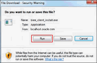 |
| 3 . | In the Oracle Business Intelligence Enterprise Edition Plus Client Tools Wizard, select the
appropriate language and click OK. Click Next on the Introduction page and the subsequent installation steps. Note: You use the Oracle BI Server DSN Configuration Wizard to set up an ODBC DSN that you can use to connect to a repository through the Oracle BI Server. You can connect to the Oracle BI Server with a wide variety of ODBC-compliant query and reporting tools, as well as other clients such as remote Administration Tool clients. |
Creating Analyses
Creating an Analysis and Using the Analysis Editor
This topic covers creating a new analysis by using the Analysis Editor.To build an analysis, do the following:
| 1 . |
From the Home page, click New
> Analysis. 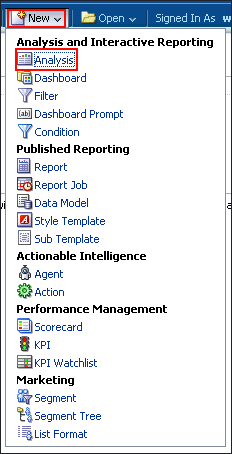 |
||||||||||||||
|---|---|---|---|---|---|---|---|---|---|---|---|---|---|---|---|
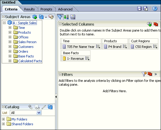
| 2 . | The Select Subject Area pop-up appears. A subject area contains columns that represent information about the areas of an organization's business or about groups of users within an organization. When you create a new analysis, this subject area is known as the primary subject area and will appear in the Subject Areas pane of the Analysis Editor. If, as you work, you need more data, you can add additional subject areas if you have permission to access these additional subject areas.  In the Select Subject Area pop-up, select A - Sample Sales. The Analysis Editor is displayed. |
||||||||||||||
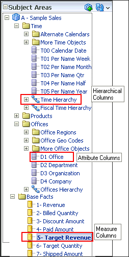
Observe the Analysis Editor, which is used to explore and interact
with information by visually presenting data in tables, graphs, pivot
tables, and so on.  The Analysis Editor is composed of tabs and panes, as shown in the screenshot, representing the subject area (columns), available catalog objects, selected columns for the analysis, and filters (which limit the selected data). A subject area contains folders, measure columns, attribute columns, hierarchical columns, and hierarchy levels that represent information about the areas of an organization's business or about groups of users with an organization. Subject areas usually have names that correspond to the types of information that they contain, such as Period, Regions, Products, Orders, and so on. In this example:
|
|||||||||||||||
|
|
There are various column types in a subject area. They are:
 |
||||||||||||||
| 3 . | a. Select the following columns for your analysis.
 to expand the folders and double-click the required column names to
get them in the Selected Columns section. In this example, expand the
Customers folder>Cust Regions,
and then double-click C50 Region to get it in the Selected
Columns section.
to expand the folders and double-click the required column names to
get them in the Selected Columns section. In this example, expand the
Customers folder>Cust Regions,
and then double-click C50 Region to get it in the Selected
Columns section. 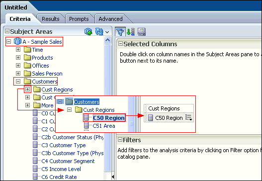 c. The selected columns are displayed in the Selected Columns section. Your analysis criteria should look like this: 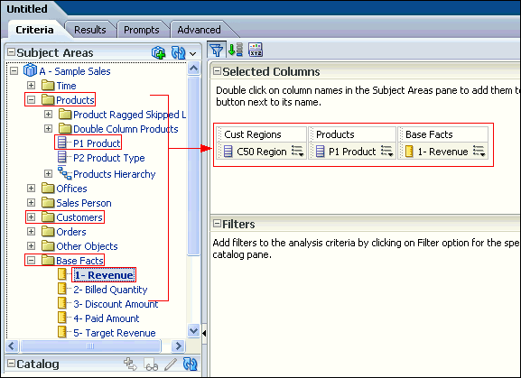 Note: In the Selected Columns section, you can reorder the columns in your analysis by clicking and dragging them. The image shows the step-by-step view of reordering the columns. 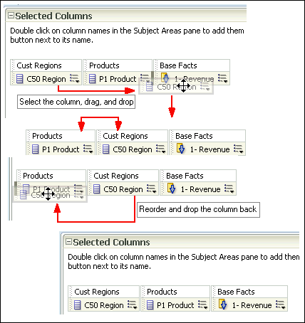 |
||||||||||||||
| 4 . | Click the Results tab. The default Compound Layout is displayed. 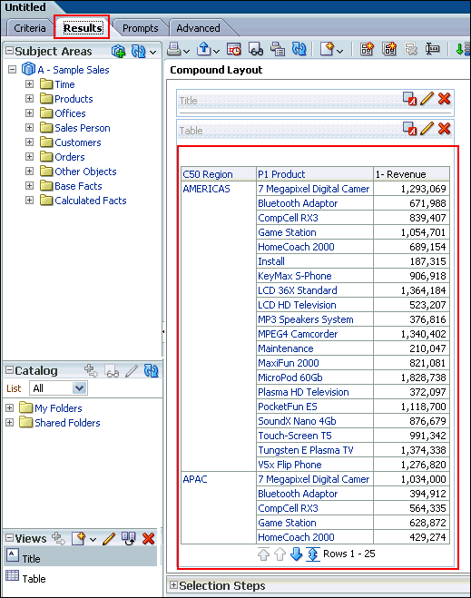 The Compound Layout is a composition of many views. By default, both a Title view and a Table view are defined for you when using attribute and measure columns. A Pivot Table view is automatically created when using hierarchical columns in your analysis. The Title view allows you to add a title (the default), a subtitle, a logo, a link to a custom online help page, and timestamps to the results. The Table view displays results in a standard table. You can navigate and drill down in the data. You can add totals, customize headings, and change the formula or aggregation rule for a column. You can also swap columns, control the appearance of a column and its contents, and specify formatting to apply only if the contents of the column meet certain conditions. Note: In the Compound Layout, you can create different views of the analysis results such as graphs, tickers, and pivot tables. These are covered in the upcoming topics. |
Filtering, Sorting, and Saving Your Analysis
This topic demonstrates how to filter, sort, and save the analysis you have created above.You will add a filter to the analysis and then save the filter. Filters allow you to limit the amount of data displayed in the analysis and are applied before the analysis is aggregated. Filters affect the analysis and thus the resulting values for measures. Filters can be applied directly to attribute columns and measure columns.
A filter created and stored at the analysis level is called an inline filter because the filter is embedded in the analysis and is not
stored as an object in the Presentation Catalog (Catalog). Therefore, an inline filter cannot be reused by other analyses or dashboards.
If you save the filter however, it can be reused and is known as a named filter. (Named filters can also be created from the global header.)
Perform the following steps to filter, sort and save the previously created analysis.
|
1
. |
a. Click the Criteria
tabbed page. Select the column Cust Regions>C50 Region
to create a filter. You can create a filter by hovering over
the specific column's toolbar and selecting the More
drop-down menu.  b. In the More drop-down menu, select Filter. |
|---|---|
|
2
. |
You can also create a filter by clicking the "Create a
filter for the current Subject Area" icon in the Filters
pane and then selecting the column from the drop-down list, as shown
in the screenshot. The column selected for this example is Cust Regions>C50 Region. 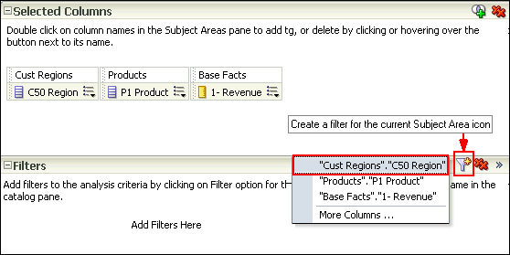 Since you have already selected a filter in the previous step you are not using this option. |
|
3
. |
The New Filter dialog box is displayed. Accept the default value for
the operator (is equal to /
is in), and enter a column value (or a range of column values)
for this condition. To do this, click the drop-down list for Value,
and select the desired checkboxes. Select Americas
and EMEA.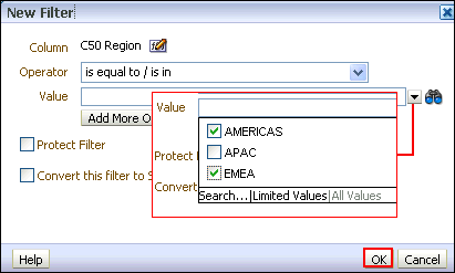 Click OK. |
|
4
. |
The Filters pane displays the newly created filter.  Save this filter. Click the More Options icon in the filters pane and select Save Filters from the drop-down list.  |
|
5
. |
The Save As dialog box appears. A filter must be saved to a subject
area folder so that it is available when you create an analysis using
the same subject area. Navigate to the Subject Area Contents folder under the My Folders. Select the A - Sample Sales folder. Name the filter Americas and EMEA filter and accept the default location. If a Confirm Save Location dialog box appears, accept the default. Oracle BI EE allows you to save any type of business intelligence object to any location within the Catalog. However, for some object types such as filters, Oracle BI EE suggests the best Catalog location. The Save As dialog box should look like this: 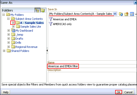 Click OK. |
The Filters pane should look like this: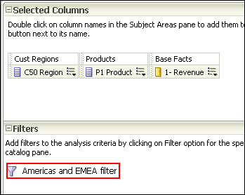 |
|
|
6
. |
Next, you save the analysis so that you can verify the creation of
your named filter within the Catalog. a. Click the Save icon to save your analysis. b. Navigate to My Folders and click the New Folder icon . The New Folder dialog box appears. 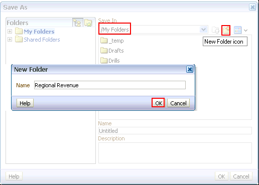 c. Name the folder Regional Revenue and click OK. Save the analysis as Regional Revenue in the catalog folder Regional Revenue. |
|
7
. |
Verify the named filter. Click the Catalog link on the global header and navigate to the folder where you saved your filter. The Americas and EMEA filter is displayed in the Catalog.  |
|
8
. |
Go to Home page, and in the Recent area, click the Edit
link for the Regional Revenue analysis. |
|
9
. |
Now you will add a sort to this analysis. a. On the Criteria tabbed page, click the More Options icon for 1- Revenue. b. Select Sort > Sort Descending. 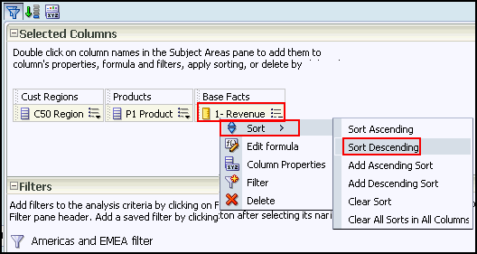 Observe that a sort icon is added to 1- Revenue. The order of the sort is indicated by an arrow; in this case, the arrows points down, indicating that it is descending. Additionally, if multiple sorts are added, a subscript number will also appear, indicating the sequence for the sort order. 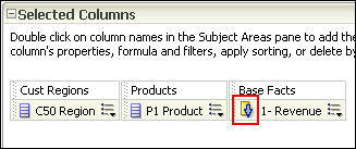 c. Save your analysis again. |
|
10
. |
Click the Results tabbed page to verify the filter
and sort are being applied to your analysis. The Compound Layout displays
the filtered and sorted analysis. 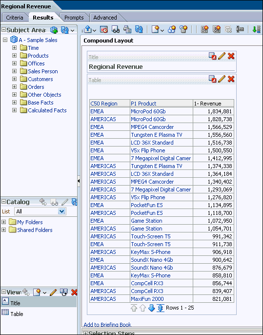 This concludes the topic of saving an analysis and sorting it. |
Creating Selection Steps for Your Analysis
This topic covers how to add selection steps for the product in the analysis. Both filters and selection steps allow you to limit the data displayed in your analysis.Unlike filters that are applied before the analysis is aggregated, selection steps are applied after the analysis is aggregated.
Selection steps only affect the members displayed, not the resulting aggregate values.
For example, the outline total for the top level of a hierarchy is not affected if some members of the hierarchy are excluded from the selection.
Selection steps are per column and cannot cross columns. While measure columns appear in the Selection Steps pane, you cannot create selection steps for them.
Note that however, the grand totals and column totals are affected by selections. You can create selection steps for both attribute columns and hierarchical columns.
To add selection steps for Product, do the following:
| 1 . | Click the plus icon to expand the Selection Steps pane of the Compound Layout. to expand the Selection Steps pane of the Compound Layout. 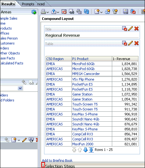 The Selection Steps pane opens.  |
|---|---|
| 2 . |
Under Products - P1 Product, hover over 1.
Start with all members, and click the pencil
icon. |
| 3 | The Edit Member Step dialog box appears with the list of available products.  You will use the shuttle icons to move column members between the Available and Selected columns.  |
| 4 . |
Click the Move All shuttle icon to move all members
from the Available pane to the Selected
pane.  |
| 5 . | In the Selected column, select Install and Maintenance and click the Remove icon to return these two members to the Available column.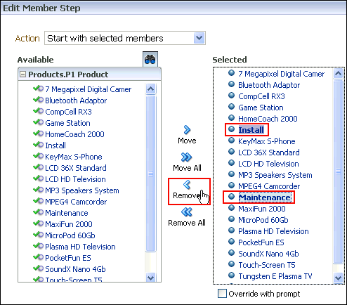 You can use Ctrl+C and click to select multiple members in the list. Click OK. Note that the two members that you removed(Install and Maintenance), are not selected anymore. 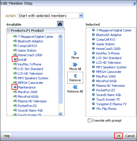 |
| 6 . | a. The Selection Steps pane appears with the
new values added. Observe that you can also save the Selection Steps
as an object in the Catalog by clicking the Save icon.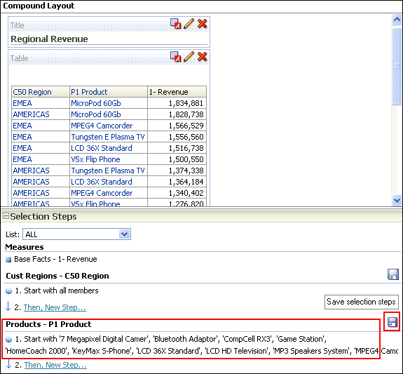 b. Click the minus sign icon to minimize the Selection Steps pane . 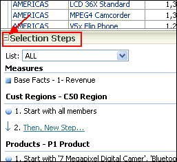 |
| 7 . |
Verify your results by reviewing your analysis in the Table view of
the Results tab. 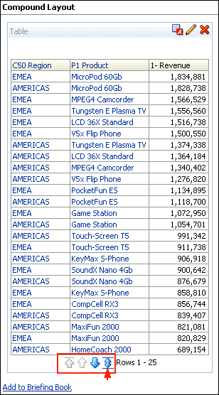 Click the double-headed arrow icon within the Table view to display all rows of the analysis. The analysis appears with all 34 rows. . 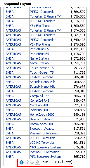 |
Formatting and Adding Totals to Your Analysis
To add formatting and totals to your analysis, do the following:| 1 . | To add totals to your analysis, click the Edit View icon in the Table view.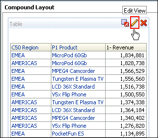 The Table Editor appears. 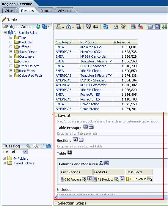 |
|---|---|
| 2 . |
a. To add a grand total to the analysis, click the
Totals icon to the right of Columns and Measures
in the Layout pane of the Table editor. 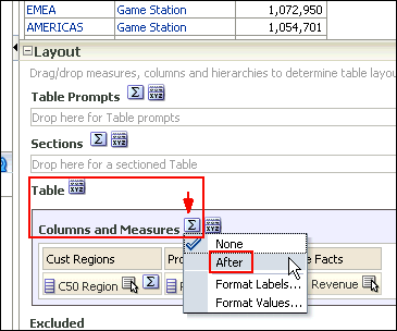 b. Select After from the drop-down list. Review the results in the Preview pane, and note that the Totals icon now displays a green checkmark, indicating that a grand total has been added to the analysis. 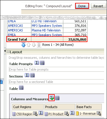 c. Click Done. |
| 3 . | Before adding a total to the Region, remove the sort from 1 - Revenue. a. Click the Criteria tabbed page. b. Click the More Options icon for 1- Revenue and select Sort > Clear Sort. 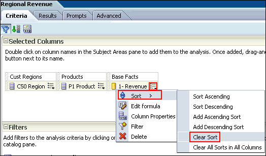 c. Click the Results tabbed page and review the Table view to confirm that the sort has been removed from the analysis.  |
| 4 . | Now you will add a total by region to your analysis. a. Click the Edit View icon  in the Table view. The Table Editor appears. in the Table view. The Table Editor appears. b. In the Layout pane, click the Totals icon for C50 Region.  c. Select After from the drop-down list. Review the results in the Preview pane, and note that the Totals icon now displays a green checkmark, indicating that a total has been added for that specific column/region. 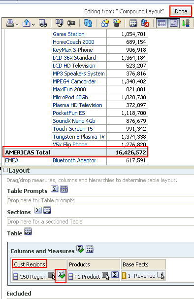 |
| 5 . | After you create and run an analysis, default formatting
rules are applied to the analysis' results. Default formatting
rules are based on cascading style sheets and XML message
files. You can create additional formatting to apply to specific
results. Additional formats help you to highlight blocks of
related information and call attention to specific data
elements. You can also use additional formatting to customize
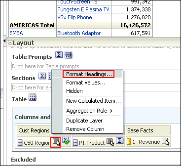
the general appearance of analyses and dashboards. Now you will apply formatting to the C50 Region column. You apply formatting to a heading. Click the More options icon  for the C50 Region and select Format Headings.
 The Edit Format dialog box appears. 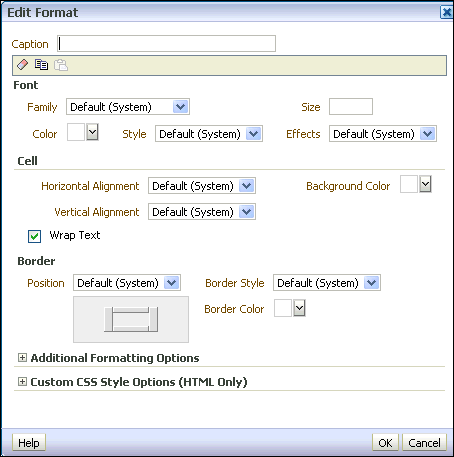 |
| 6 . | a. In the Caption text box, enter Region. b. In the Font area, click the drop-down list for Color and select a red color from the Color Selector dialog box. Click OK. 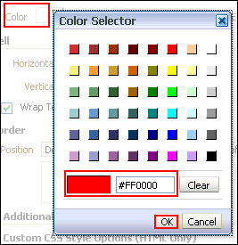 c. In the Cell area, click the drop-down list for Background Color and select a light blue color from the Color Selector dialog box. Click OK. 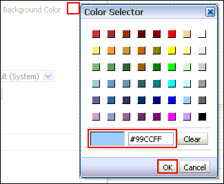 d. Click OK in the Edit Format dialog box to see the results of your format changes for the C50 Region. The Preview pane should look like this: 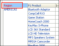 |
| 7 . | a. Click the Table View properties icon on the toolbar.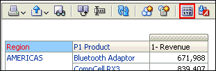 The Table Properties dialog box appears. 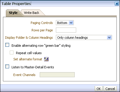 b. Select the Enable alternating row "green bar" styling check box, and click OK. 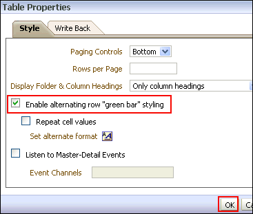 c. The Preview pane should look like this. Click Done and then save your analysis. 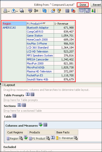 This concludes the topic of formatting and adding totals to your analysis. |
Adding a Graph to an Analysis
In this topic, you learn how to add a graph to an analysis, and how to apply a saved filter and format the graph.Enhancing an Analysis by Adding a Graph
In this subtopic, you begin by creating a new analysis to which you add a graph and apply a named filter created in the first topic. Perform the following steps:| 1 . |
Create a new analysis by using the same columns that you used to create
Regional Revenue. Select New
> Analysis on the global header. Use A
- Sample Sales Subject Area.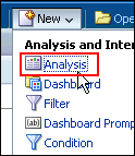 |
|---|---|
| 2 . | Add C50 Region from Cust Regions, P1 Product from Products, and 1 - Revenue from Base Facts to Selected Columns.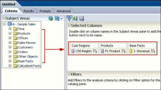 |
| 3 . |
Next, you will add a named filter that you previously created to limit
the analysis to just Americas and EMEA data. a. In the Catalog pane, navigate to locate your filter Americas and EMEA filter. 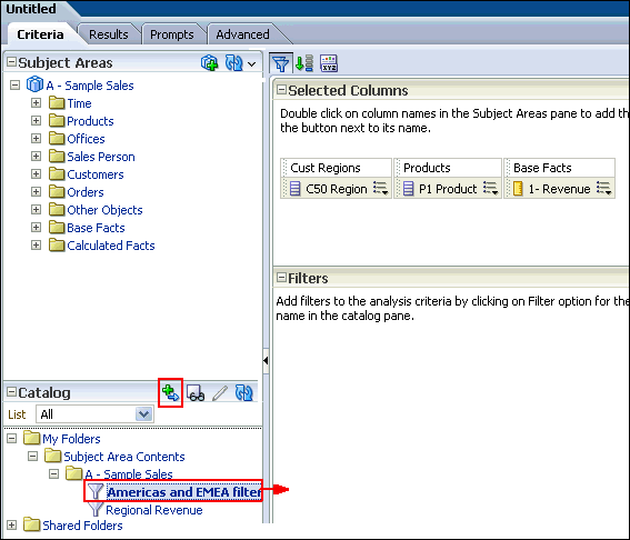 b. Select the filter and click the Add More Options icon. |
| 4 . |
a. In the Apply Saved Filter dialog box, select the
Apply contents of filter instead of a reference to the filter
check box. This option adds the filter as an inline filter, allowing
you to make changes without changing the Catalog filter item. Note that
if you do not select this check box, the filter is added as a named
filter that you can view, but not edit.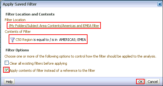 b. Click OK. The filter is added to your analysis. 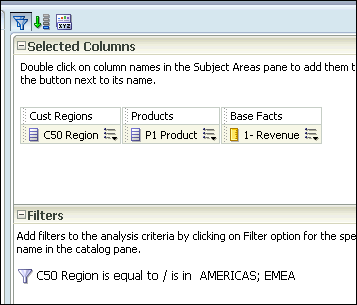 |
| 5 . | Save the analysis to your Regional Revenue folder, entering Regional Revenue Graph as the analysis name.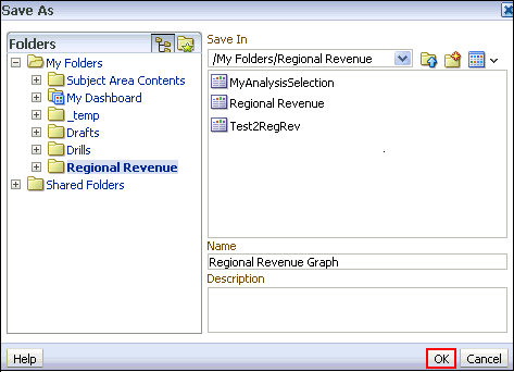 |
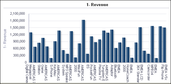
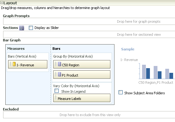
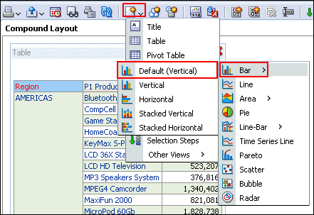
| 6 . | You will add a graph to this analysis. a. Click the Results tabbed page, and click the New View icon. 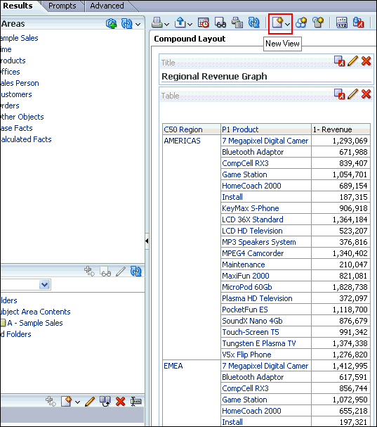 b. Select Graph > Bar > Default (Vertical) from the menus. 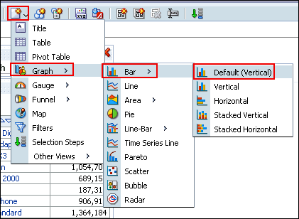 The default Graph view appears below the Table view. 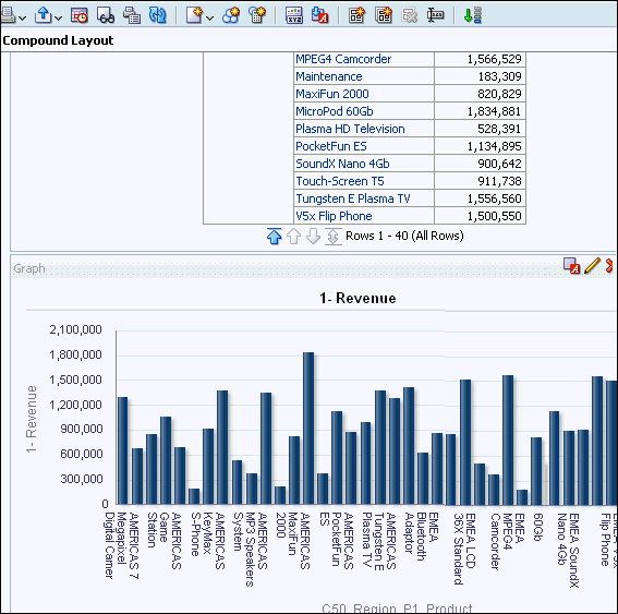 |
| 7 . | Click the Remove View from Compound Layout icon for both Title and
Table views. 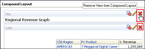 Both views are removed from the Compound Layout. Note however, that they are still available for use from the Views pane.  |
| 8 . | Save the analysis. |
Formatting the Graph
To enhance the appearance of a graph, perform the following steps:|
1
. |
Click the Edit View
icon to begin your formatting changes. The Graph editor appears.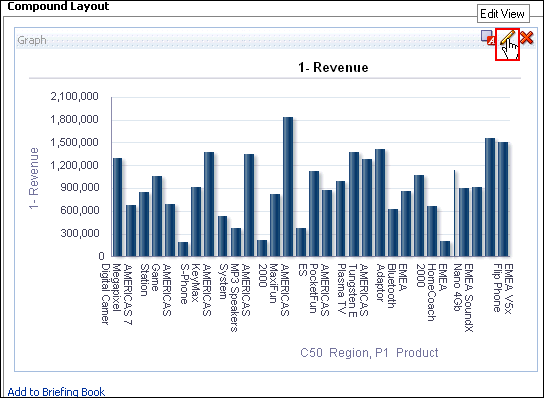 |
||||||||
|---|---|---|---|---|---|---|---|---|---|
|
2
. |
The Graph, like other view editors, is composed of three sections:
|
||||||||
|
3
. |
Click the Edit properties
icon. 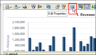 The Graph properties dialog box appears.  The Graph properties dialog box is composed of four tabbed pages: General, Style, Scale, and Titles and Labels. These tabbed pages allow you to do the following:
|
||||||||
|
4
. |
a. Select Enable
for Horizontal Axis from the "Zoom and Scroll" check
boxes. When zooming and scrolling is enabled for a graph, then the graph
includes a Zoom icon. The Zoom icon allows you to zoom in and out of
a graph's plot area via its axes. Once you zoom in on an axis, you can
scroll the axis. When you zoom an axis, a zoom and scroll slider appears. b. Select left from the Legend location drop-down list. The dialog box should look like this: 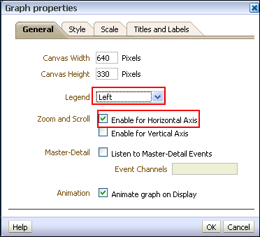 Note: The "Animate graph on Display" checkbox specifies whether to show initial rendering effects and is selected by default. For example, the bars on a horizontal graph start at the x-axis and move up the scale on the x-axis to the current measurement level. "Listen to Master-Detail Events" allows you to specify this analysis as a detail view in a master-detail relationship. You will use this option in a subsequent step when working with pivot tables |
||||||||
|
5
. |
a. Click the Style
tabbed page. 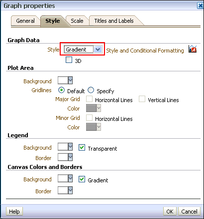 b. Click the Style drop-down list for Graph Data and select Gradient. The Graph Data area allows you to choose a style for specific types of graphs. For example, you might choose pattern fill for to highlight differences on a line-bar graph or gradient for a bar graph to make the data values standout. |
||||||||
|
6
. |
Click the Background
drop-down list in the Plot area, and select a
light blue color from the Color Selector. Click OK.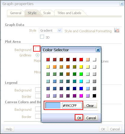 The Graph properties dialog box should look like this: 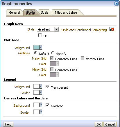 |
||||||||
|
7
. |
Click the Scale tabbed
page. The Scale tabbed page appears.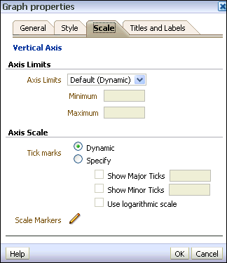 Specifying setting for the axis limits and tick marks enables you to control what you see on your graph. If you override the system default for tick marks, the colors that you have selected for horizontal and vertical gridlines on the General properties tabbed page will be applied to both major and minor ticks. |
||||||||
|
8
. |
a. Click the Titles
and Labels tabbed page.  b. Deselect the check box for Use measure name as graph title and enter Regional Revenue in the Title text box. 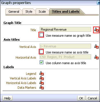 c. Click the Format Title icon  for Graph Title.
 The "Font Format: Title" dialog box appears. You use this dialog box to specify how titles, legend labels, and so on are handled (such as truncated automatically) and to specify font properties. Click Cancel. 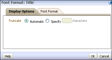 |
||||||||
|
9
. |
Deselect the check box for Vertical
Axis Title and click OK
to close the Graph Properties dialog box.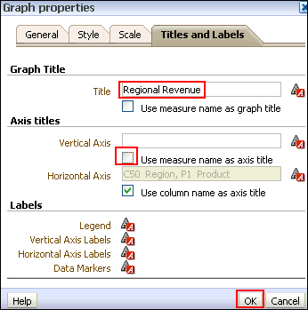 The preview pane refreshes and should look like this: 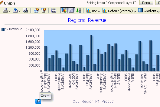 Examine the changes that you made to the graph. The formatting changes have been applied along with a new title and a horizontal zoom. |
||||||||
|
10
. |
Click the Zoom icon
and select Zoom In.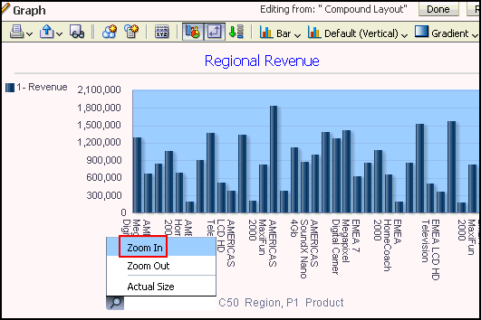 Once you have zoomed in, a slider appears. 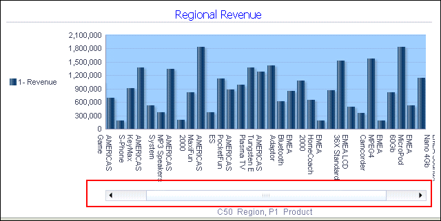 |
||||||||
|
11
. |
a. In the Layout pane, move C50
Region from the Group By drop target to the Graph Prompts drop
target. The preview pane refreshes:  The prompt allows you to select each region individually, making the graph a bit easier to consume. b. Move C50 Region to the Sections area and select the Display as Slider check box. The Graph editor should look like this: 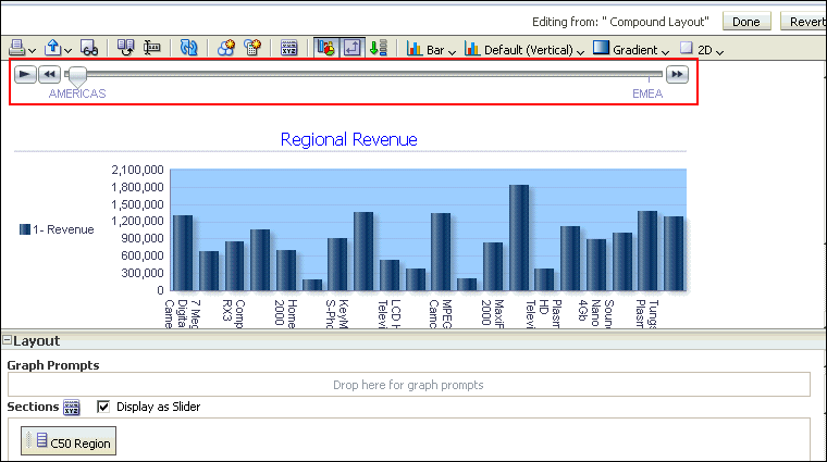 When you move along the slider for a particular region, the graph changes accordingly. c. Click Done and then save your analysis. 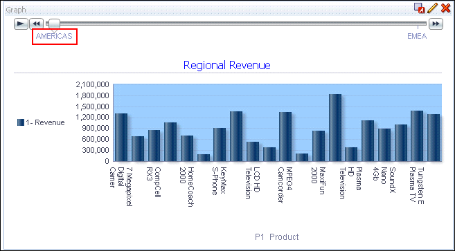 You can further experiment with the region slider by clicking the C50 Region or Americas link. The graph display changes accordingly. 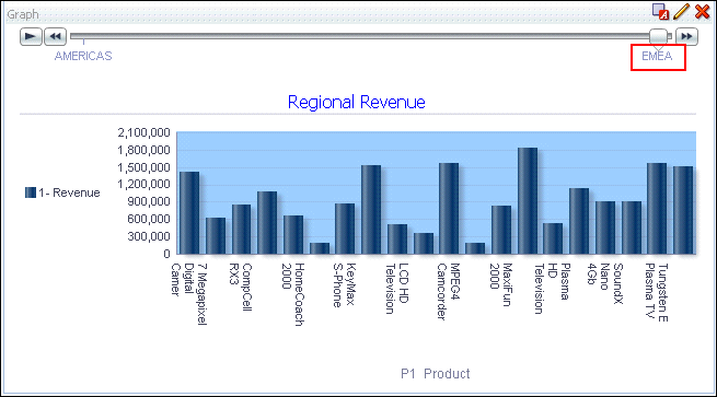 |

Working with Pivot Tables, and Master-Detail Linking
In this topic, you learn how to create an analysis with a Pivot Table view, format, add a calculated column to a pivot table, add a Gauze view, and create a master-detail linking. You also learn how to filter your results using Selection Steps in pivot tables.Creating and Formatting a Pivot Table view and Adding Calculations
In this subtopic, you begin by creating a new analysis with a hierarchical column and then applying a named filter. Also you format and add totals.Pivot tables provide the ability to rotate rows, columns, and section headings to obtain different perspectives of the same data.
They are interactive in that they are drillable, expandable, and navigable.
To create an analysis with a pivot table, perform the following steps:
|
1
. |
Click New > Analysis on the global header. Select A-Sample Sales as the subject area. |
||||||||||
|---|---|---|---|---|---|---|---|---|---|---|---|
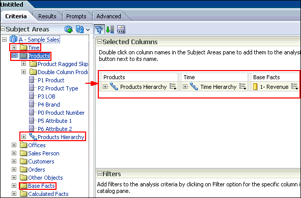
|
2
. |
In the Analysis Editor, add the following columns to the analysis criteria:
 |
||||||||||
|
3
. |
Click the Results tabbed
page to view the analysis and inspect the pivot table. Observe that
the Pivot Table view is included by default.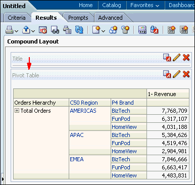 |
||||||||||
|
4
. |
a. Return to the Criteria tabbed page. b. Apply the Americas and EMEA filter named filter as you did previously. c. Edit the column properties for Revenue. Click the More Options icon for 1 - Revenue and select Column Properties. 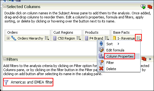 The Column Properties dialog box appears. |
||||||||||
|
5
. |
Select the Column Format
tabbed page. Select the Custom
Headings check box and enter Revenue
in the Column Heading text box. |
||||||||||
|
6
. |
Select the Data Format
tabbed page. Select the Override
Default Data Format checkbox and select the values as indicated
below in the image. Click OK. |
||||||||||
|
7
. |
Click the Results tabbed
page. Review the formatting changes that you made to the Revenue column.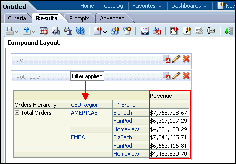 |
||||||||||
|
8
. |
Delete the Title view and then click the Edit
View icon The Pivot Table editor appears. |
||||||||||
|
9
. |
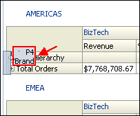
Format the pivot table as follows: a. Drag P4 Brand below Measure Labels. b. Drag C50 Region to the Sections area. The pivot table should look like this: 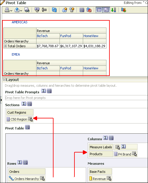 |
||||||||||
|
10
. |
Add a calculation to the pivot table by duplicating the Revenue
column. Click the More Options
icon  for
the Revenue column and select Duplicate
Layer. for
the Revenue column and select Duplicate
Layer.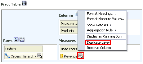 The duplicated Revenue column appears. 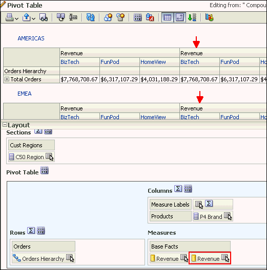 |
||||||||||
|
11
. |
a. Select the More
Options > Format Headings to edit the properties for the duplicate
column.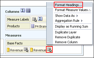 b. In the Caption text entry box in the Edit Format dialog box, name the new column % Revenue and click OK. 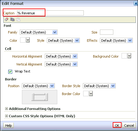 |
||||||||||
|
12
. |
Change the calculation to reflect a percentage of the parent. Select
the More Options > Show Data
As > Percent of > Row Parent.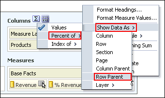 The Pivot Table editor looks like this: 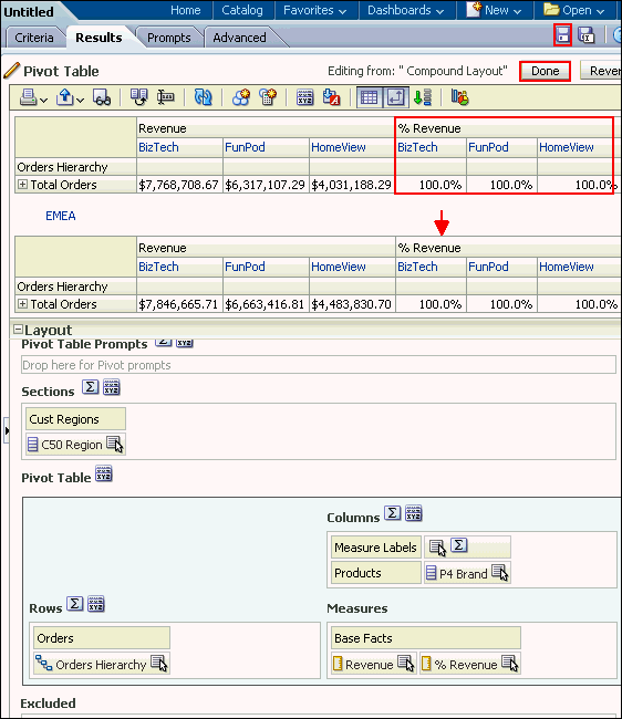 Click Done and save the analysis as Regional Revenue Pivot. The pivot table should look like this: 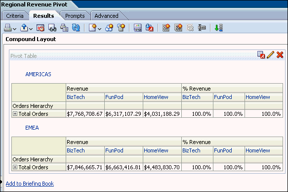 |
||||||||||
|
13
. |
a. Expand the Orders
Hierarchy by clicking the plus sign icon  for Total Orders for the Americas.
The plus and minus icons are used to expand and collapse the data for
analysis. Orders Hierarchy contains Orders
on the row edge and Total Orders as the parent.
Revenue is the measure.
for Total Orders for the Americas.
The plus and minus icons are used to expand and collapse the data for
analysis. Orders Hierarchy contains Orders
on the row edge and Total Orders as the parent.
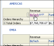
Revenue is the measure.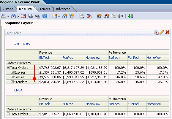 Because hierarchical columns imply pivot tables, you can sort not only on members and measures, but also on rows. Hierarchical members on the row edge can include sort carat icons ( When you sort members in a hierarchical column, you always sort within the parent; that is, children are never sorted outside of their parent. The children appear below the parent in the proper sort order; the parent is not sorted within its children. b. The Total Orders parent member represents an outline total for the orders. Row sort Total Orders, for the Americas in Descending sequence and examine the results within the pivot table. The product brands on the column edge are sorted, reflecting sorted Revenue values in descending sequence for each Total Order. 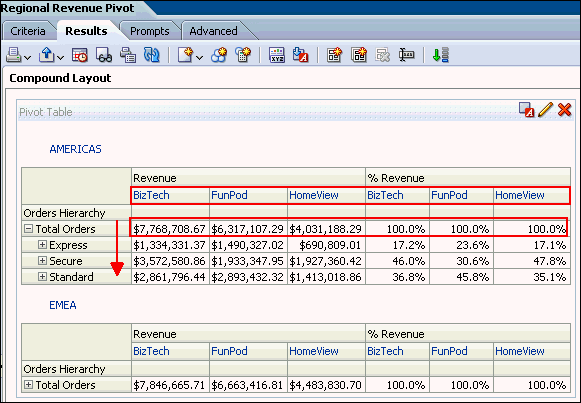 |
||||||||||
|
14
. |
Expand Express orders
and then expand 6 - Cancelled
to view the % of total revenue lost from cancellations.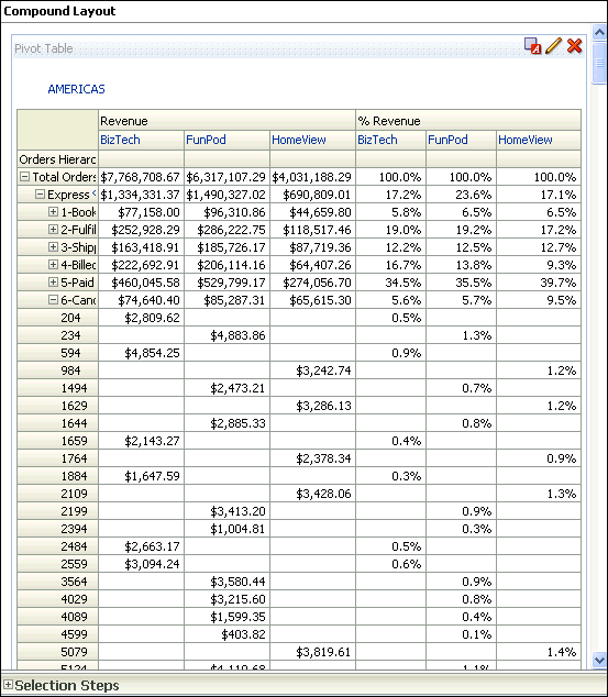 |
||||||||||
|
15
. |
a. Place your cursor on top of the Orders
Hierarchy and right-click. Select Collapse
all items in view from the menu. Notice that you can also sort,
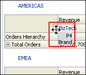
exclude columns, and move items around using this menu.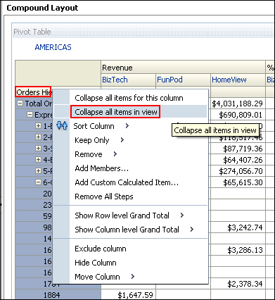 b. Place your cursor to the left of the Brand column (BizTech). A tab appears. When you hover over this tab, a swap icon appears. You use this swap icon to swap columns with rows or to reposition a column or row along a different axis.
 d. Release the mouse button and review the pivot table. 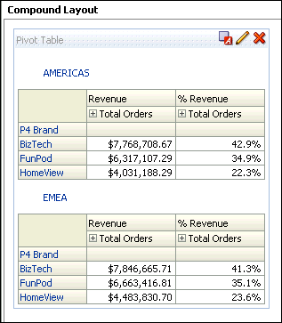 e. Save the analysis. |
Adding a Gauze View
In this subtopic, you add a Gauze view to the Compound Layout.To add a Gauze view, perform the following steps:
|
1
. |
Click the New View icon
and select Gauge > Default
(Dial).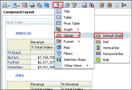 |
|---|---|
|
2
. |
Scoll down and view the gauge. 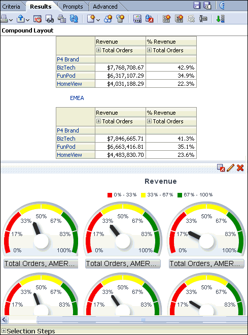 |
|
3
. |
Edit the gauge properties to display medium size and remove the footers.
Use the pencil icon to access gauge editor. The gauge view should look
like this. 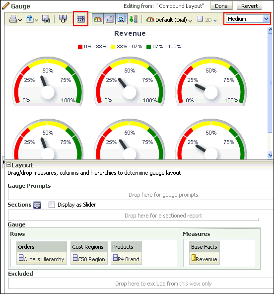 |
|
4
. |
Add a slider to the gauge (for C50 Region). In the Layout pane, drag C50 Region to the Sections drop target and select Display as Slider. 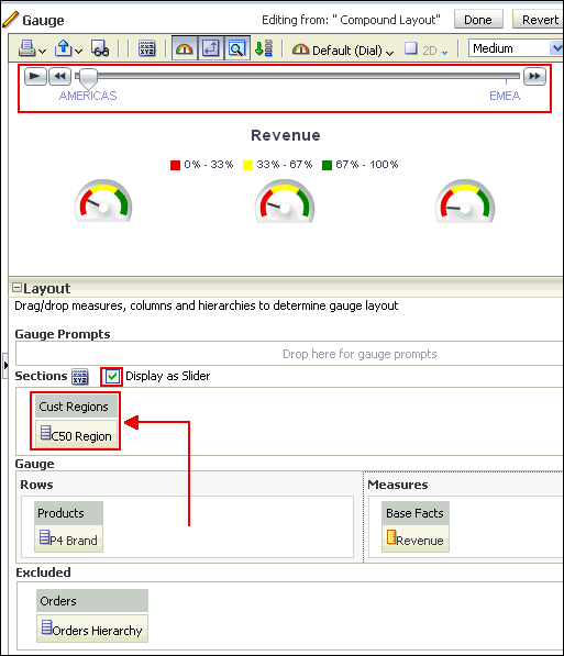 Click Done and save the analysis. |
Adding Selection Steps and Selection Steps View
In this subtopic, you begin by creating a new analysis with hierarchical columns and apply selection steps.To create an analysis with a pivot table, perform the following steps:
|
1
. |
Select the New > Analysis on the global header.
Select A – Sample Sales as the subject area. |
||||||||
|---|---|---|---|---|---|---|---|---|---|
|
2
. |
In the Analysis Editor, double-click the following columns:
 |
||||||||
|
3
. |
Click the Results tab. Two views appear: Title and
Pivot Table. Because you are using hierarchical columns, a Pivot Table
view is generated automatically. 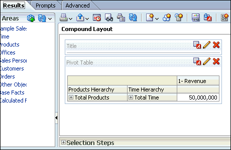 Expand Time Hierarchy. 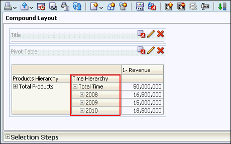 |
||||||||
|
4
. |
a. Delete the Title view. b. Scroll down to view the Selection Steps pane. Expand it. Note: If you do not see the Selection Steps pane, click the Show/Hide Selection Steps pane icon   |
||||||||
|
5
. |
You will add members based on Hierarchy for Products Hierarchy.
In the Products - Products Hierarchy section, click Step 2.Then, New Step. Select Select Members based on Hierarchy.  |
||||||||
|
6
. |
The New Hierarchy Selection step dialog box appears.  Select “Based on Family Relationship” from the Relationship drop-down list. |
||||||||
|
7
. |
The New Hierarchy Selection Step dialog box expands. Select “ Keep only”, “Siblings Of” as the action, and then expand Total Products and select FunPod. Move FunPod to the Selected pane.  Click OK. |
||||||||
|
8
. |
Save the analysis as My Selection Steps Analysis
under the folder My Folders>Regional Revenue. Observe
that the analysis only shows BizTech and HomeView,
since you selected Siblings of FunPod. |
||||||||
|
9
. |
Click the pencil icon
in Step 2 to edit the selection for Product Hierarchy. |
||||||||
|
10
. |
In the Edit Hierarchy Selection Step dialog box, select Include
selected members. Click OK and save the analysis.
 Observe that FunPod is included this time. 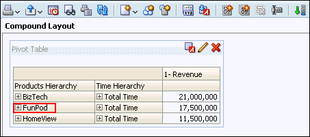 |
||||||||
|
11
. |
Selection Steps views are now available just as another view that can
be included. From the New View drop-down list, select Selection Steps. 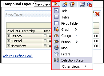 The Selection Steps view is displayed in the compound layout. 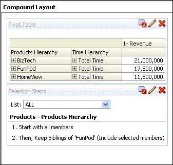 Save the analysis. |
||||||||
|
12
. |
Now, you will add a Group for Products Hierarchy. In the Product – Product Hierarchy section, click “Then, New Step.” 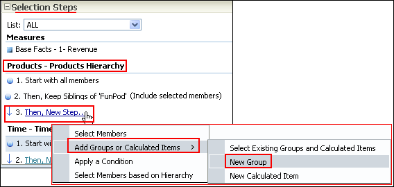 Select Add Groups or Calculated Items > New Group. |
||||||||
|
13
. |
In the New Group dialog box, enter My Group in the
Display Label text box, expand Total Product, and then select
FunPod and HomeView. Move them to the Selected pane and click OK.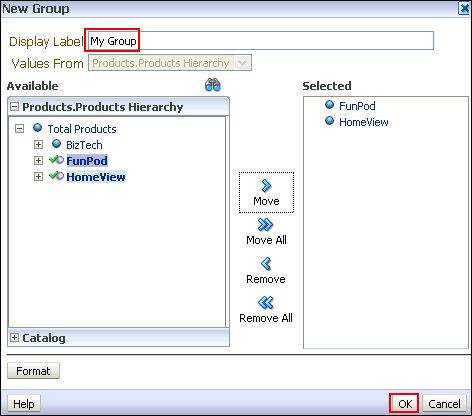 This new group is added to the Compound Layout view. 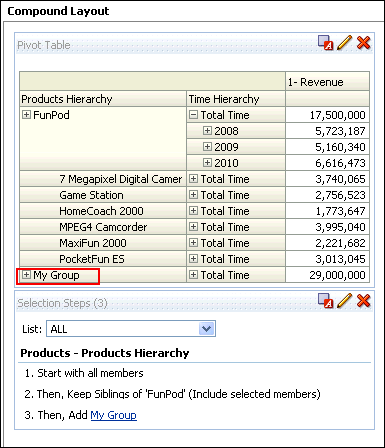 |
||||||||
|
14
. |
Click My Group in the Selection Steps View and you
will be able to see the values in My Group.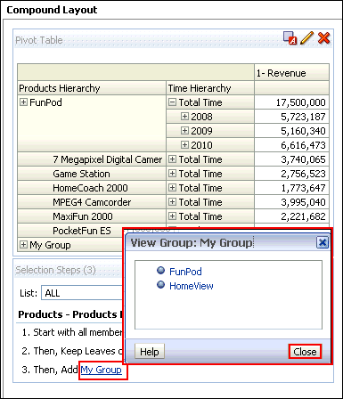 You can also see the values if you expand My Group in the Pivot table. Save the analysis. This concludes the topic of creating a Pivot table and applying selection steps to the table. |
Creating a Master-Detail Linking
Master-detail linking of views allows you to establish a relationship between two or more views so that one view, called the master view, will drive data changes in one or more other views, called detail views. To create a Master-Detail linking, for the previously created Regional Revenue Pivot analysis perform the following steps:| 1 . | Set up the master view to which you link the detail view. a. Edit the Regional Revenue Pivot analysis, and click the Criteria tabbed page. b. Click the More Options icon and select Column Properties for the C50 Region column. 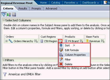 |
|---|---|
| 2 . |
The Column Properties dialog box appears. Click the Interaction
tabbed page. 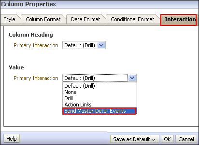 In the Value area, click the Primary Interaction drop-down list, and select Send Master-Detail Events. |
| 3 . |
When "Send Master-Detail Events" is selected,
a qualification text box, Specify
channel, appears. You use this text box to enter a name
for the channel to which the master view will send master-detail events.
This is a case-sensitive text box.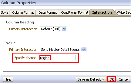 a. Enter region in the "Specify channel" text box and click OK. b. Save the analysis. |
| 4 . | Define the detail view to which the master view should
link. You can add any view that includes the same master column as the
master view. a. Click the Results tabbed page to view the Compound Layout and click Edit View for the Gauge view. 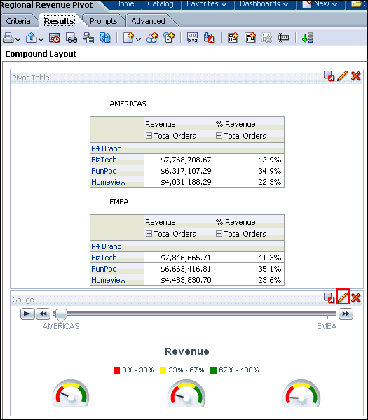 b. The Gauge editor appears. Click Edit gauge properties on the toolbar. 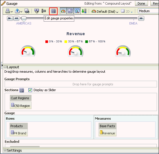 |
| 5 . | The Gauge Properties dialog box appears. a. Select the Listen to Master-Detail Events check box. b. Enter region in the Event Channels text box. Remember that this must match precisely with the text entered for the master view. c. Click OK. |
| 6 . | Click Done and then save your analysis. |
| 7 . | a. In the Pivot Table view (the master view), select AMERICAS to drill down.  Both the Pivot Table view and the Gauge view (the detail view) update to reflect the drill. 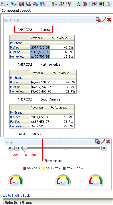 b. Save your analysis. |
Working with Other View Types
You have learned about creating the following views:- Titles
- Table
- Pivot Table
- Graph
Creating a Narrative View
You create a Narrative view to provide information such as context, explanatory text, or extended descriptions along with column values for an analysis. You can include values from attribute, hierarchical, and measure columns. If you want to include hierarchy levels in a Narrative view, use selection steps to display the levels. The Narrative view is a combination of text and query column values.To add a Narrative view, perform the following steps:
| 1 . | To create a meaningful Narrative view, begin by creating a new analysis that includes a calculated item. a. Create an analysis as you did above, including the following columns:
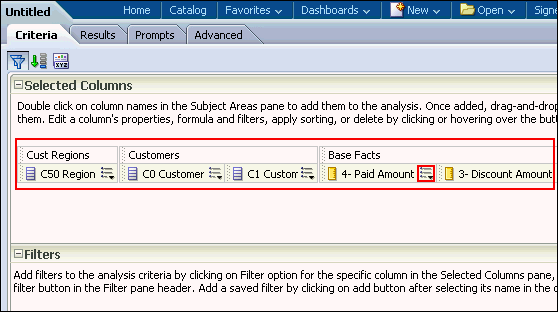 b. Change the properties of 4 - Paid Amount and 3 - Discount Amount to include dollar signs, commas, and two decimal places. The properties should look like this: 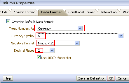 c. Add a filter to C50 Region and select only the Americas region and save the filter as AMERICAS only. 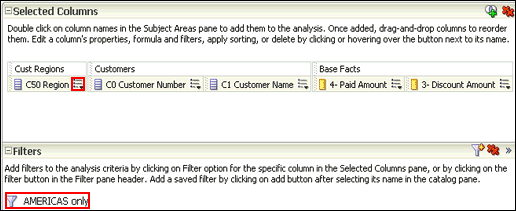 |
||||||||||||
|---|---|---|---|---|---|---|---|---|---|---|---|---|---|
| 2 . | a. Add 3 - Discount Amount to the Criteria tabbed page a second time. The Selected Columns within the Criteria tabbed page should look like this:  b. Edit the Column Properties for the duplicate 3 - Discount Amount column. Click More Options for this duplicate column and select Column Properties.  c. Select the Column Format tabbed page, and select the check box for Custom Headings. Enter Discnt Pct to Paid Amt in the Column Heading text box.  d. Using the Data Format tabbed page, format the data for this column as a percentage with two decimal places and then click OK.  The Selected Columns should look like this: 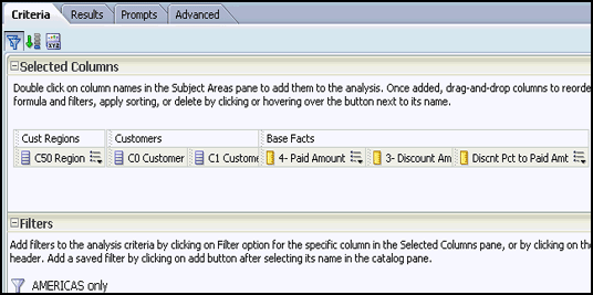 |
||||||||||||
| 3 . | a. Click More Options for Discnt Pct to Paid Amt and select Edit Formula.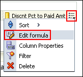 The Edit Column Formula dialog box appears: 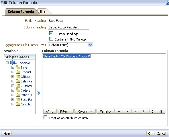 b. Enter the following formula in the Column Formula text box.
("Base Facts"."3- Discount Amount"/"Base Facts"."4- Paid Amount")*100
Hint: You can copy the line of code and paste it in
the Column Formula text box.The Edit Column Formula dialog box should look like this: 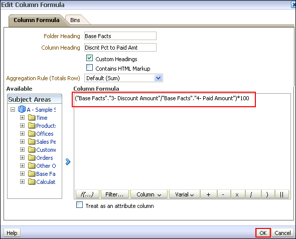 c. Click OK. |
||||||||||||
| 4 . | a. Select the Results tabbed page and remove the Title view from the Compound Layout. b. Click the Edit View icon to open the Table editor. 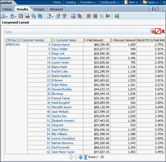 c. Click the More Options icon for C50 Region and select Hidden to hide the column. 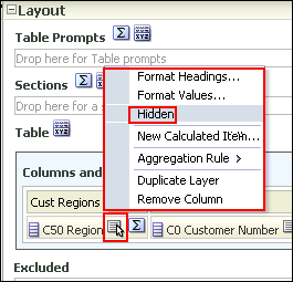 d. Click Done to review your results. The Table view should look like this:  e. Save the analysis as Customer Discounts by Region. |
||||||||||||
| 5 . | To add the Narrative view perform the following steps: a. Click the New View icon on the toolbar and select Other Views > Narrative. 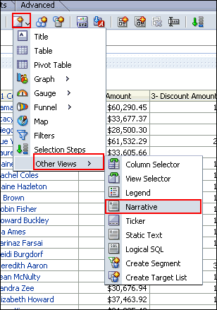 b. Drag the Narrative view above the Table view. 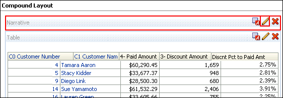 c. Click the Edit View icon for the Narrative view. |
||||||||||||
| 6 . | The Narrative editor appears.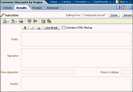
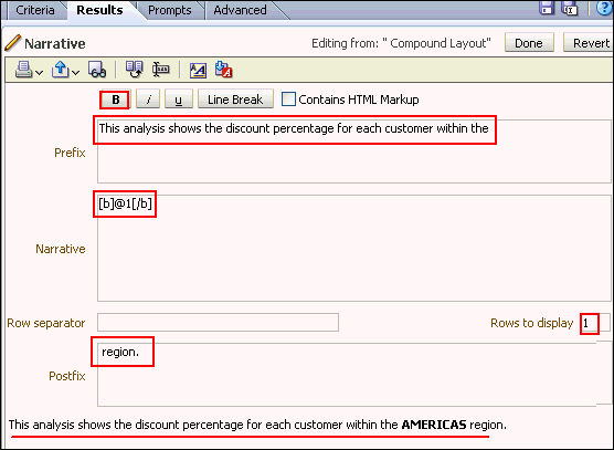 c. In the Narrative text box, enter @1, where the number "1" represents the first column in the analysis (C50 Region). Then, select the @1 that you entered and click the bold icon. d. In the Postfix text box, enter region., ensuring that you include a space before region and a period after region. e. Enter 1 in the "Rows to display" text box. Notice that a preview is provided at the bottom of the editor. |
||||||||||||
| 7 . | Click Done and save your analysis. The Compound Layout should look like this: This concludes the topic of creating a narrative view. |
Creating Column Selector and View Selector Views
A Column Selector view adds a column selector to the results. A column selector is a drop-down list from which users can dynamically change the columns that display in results. This will allow you to analyze data along several dimensions. By changing the measure columns, you can dynamically alter the content of the analyses you have created.To create a Column Selector and View Selector views, perform the following steps:
| 1 . | a. Open the Regional Revenue analysis in the Analysis Editor. The Results tabbed page appears. b. Click the New View icon and select Other Views > Column Selector. 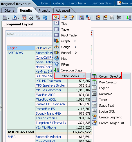 |
|---|---|
| 2 . |
The Column Selector view appears. Drag the Column Selector view above the Title view.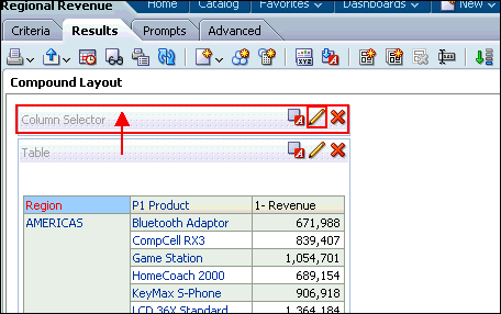 Click the Edit View icon for the Column Selector view. The Column Selector editor appears.  |
| 3 . |
a. Select the
Include Selector C50 Region check box. b. In the Label (optional) Choices text box, enter Choose a column:. c. With Column still selected, double-click the following columns to add to the selector: P4 Brand, P3 LOB, and P2 Product Type. 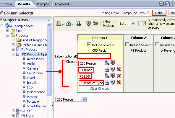 d. Click Done. The Compound Layout appears: 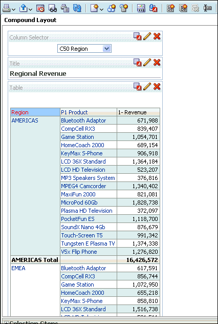 |
| 4 . | a. Click the Column Selector drop-down list and select P3 LOB: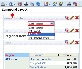 b. The values change appropriately. Note, however, that because you set a custom heading for the C50 Region column earlier, the custom heading is still displayed for the column. 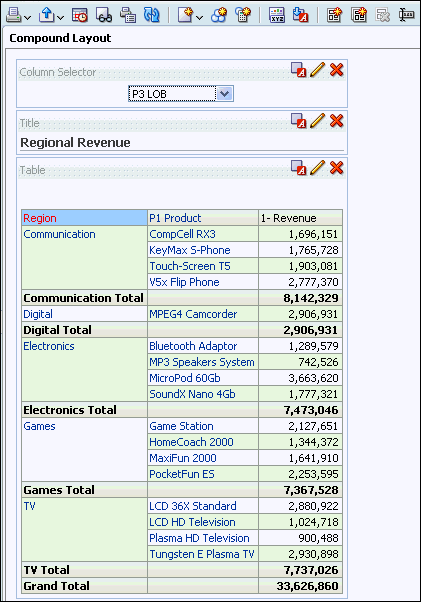 c. Save the analysis. |
| 5 . |
Now you will add the View Selector view. A View Selector view provides a drop-down list from which users can select a specific view of analysis results from among saved views. A View Selector view is analogous to a storage container, because it holds other views that have been selected in the editor for display. a. Perform these steps before adding the View Selector view:

 These changes will allow you to showcase the analytic data-driven views. Regional Revenue should look like this: 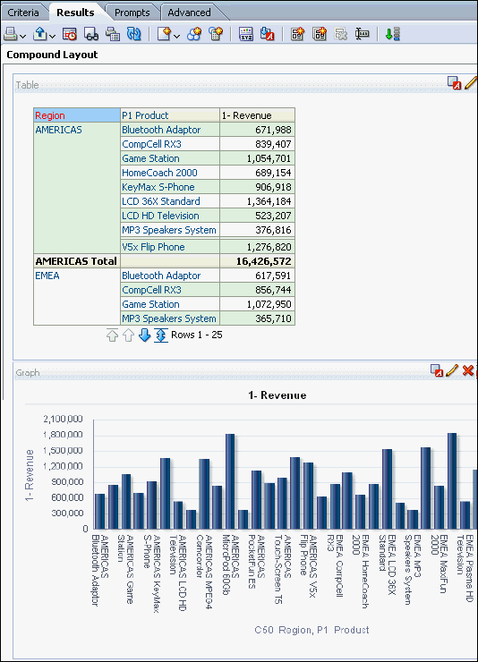 |
| 6 . | a. Click the New View icon on the toolbar and select Other Views > View Selector. 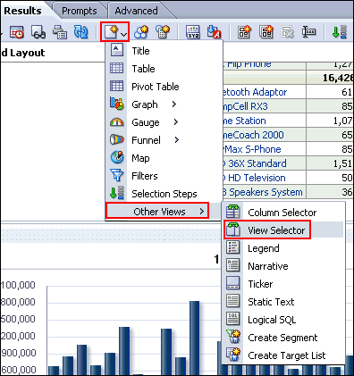 b. Drag the View Selector view to the right of the Table view. 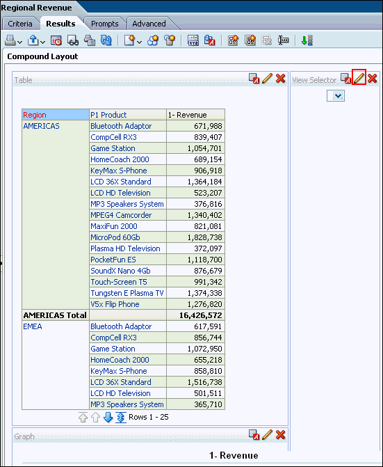 c. Click the Edit View icon for the View Selector view. |
| 7 . | a. The View Selector editor appears.In the Caption text box, enter Choose a view:. b. In the Available Views list, select the Table and Graph views and click the shuttle icon to move them to the Views Included list. 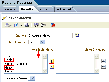 A preview appears at the bottom of the editor. Note that these views are data-driven views, unlike the Column Selector and Title views, which were deleted from the Compound Layout. 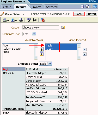 c. Click Done. |
| 8 . | The Compound Layout should look like this when the Graph view is selected: Do not save your changes to the analysis. |
Creating a Simple Trellis View
| 1. |
Create a new analysis by selecting New>Analysis
on the global header, and then selecting A-Sample Sales
as the subject area. |
||||||||||
|---|---|---|---|---|---|---|---|---|---|---|---|
| 2. |
On the Criteria tab, select the following columns:
 |
||||||||||
| 3 . | Click the Results tab. Two views Title and Table appear.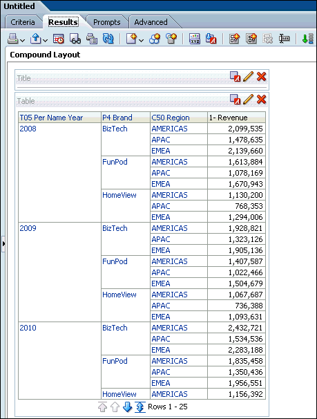 |
||||||||||
| 4 . |
Add the Trellis view. Select New View>Trellis>Simple.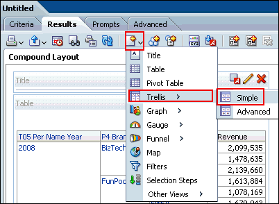 Scroll down to view the Trellis view. 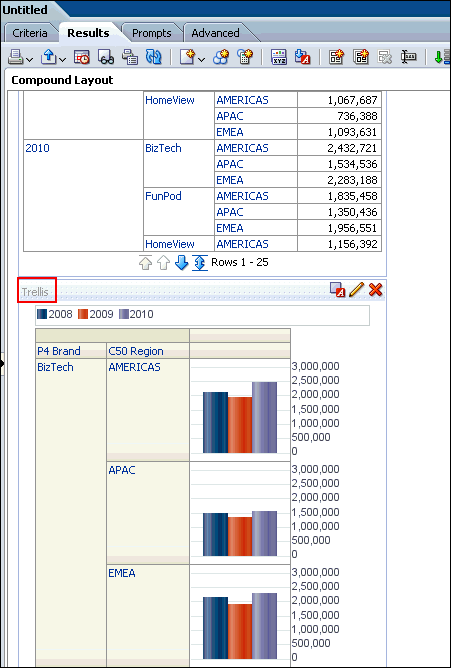 |
||||||||||
| 5 . | Delete both the Title and Table views.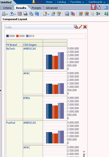 |
||||||||||
| 6 . | Save the analysis as My Trellis View, under the folder My Folders/Regional Revenue 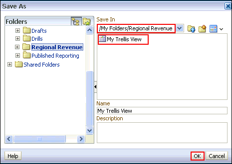 |
||||||||||
| 7 . | Click the Edit View pencil icon in the Trellis view at the Compound Layout. Note that the layout pane appears vertical. 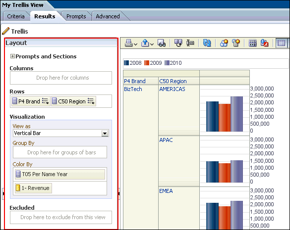 |
||||||||||
| 8 . | Arrange the dimensions and measure as shown below: 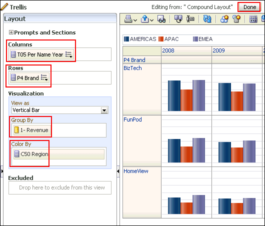 Click Done. |
||||||||||
| 9 . |
The Trellis view appears. Save the analysis. Observe that the measure
has the same scale for all the Brands.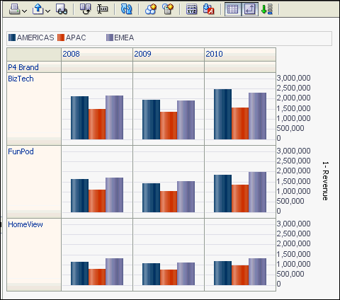 This concludes the topic of creating a Simple Trellis view. |
Building Dashboards
In this topic, you learn about My Dashboard view and how to create and edit a shared dashboard, adding a saved analysis that you have created previously. Dashboards provide personalized views of corporate and external information. Based on your permissions, you can view preconfigured dashboards or create your own personalized views. Users with administrative privileges can create shared dashboards for groups of users with common responsibilities or job functions. The ability to create and edit dashboards is controlled by the Manage Dashboard privilege, which is managed by the administrator.You can view your personalized views by selecting My Dashboard from the Dashboards drop-down list. You can also set My Dashboard as your default dashboard. Preconfigured dashboards appear in the Dashboards drop-down list. They can be created by administrators and shared with groups of users with common responsibilities or job functions.
Exploring and Editing My Dashboard
My Dashboard, a personalized view, is a dashboard page that you create and save as your default, personal starting page by using the Preferences tabbed page in My Account dialog box. To open My Dashboard, perform the following steps:| 1 . |
Click the Dashboards link on the global header and then click My Dashboard. An empty My Dashboard page appears.  When you open a dashboard, including My Dashboard, the content appears on one or more dashboard tabbed pages. Pages contain the columns and sections that hold the content of a dashboard, and every dashboard has at least one page. Multiple pages are used to organize content. This example shows an empty My Dashboard page with no content. Hover over the Edit icon to edit the dashboard and add content. Note: If you have chosen or if your company has setup My Dashboard as your default, then you use dashboard template pages to populate your personal dashboards (My Dashboard) when you first log in as a new user. This allows you to see one or more dashboard pages with content, rather than an empty dashboard. It also gives you a starting point to build your own dashboard pages. |
|---|---|
| 2 . | Click the Edit icon () to add content to your empty dashboard page. The Dashboard Builder appears and automatically creates page 1 of your dashboard (the first tabbed page). 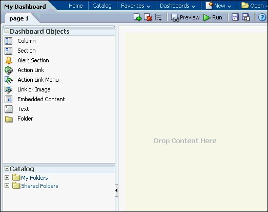 Using the Dashboard Builder, you can add pages and objects to a dashboard and control the page layout. The Dashboard Builder is composed of the following:
 |
| 3 . | As mentioned above, the Dashboard Objects pane provides
you with a list of objects to add as content to a dashboard page. You
will have to drag the object to the Page Layout pane on the right.
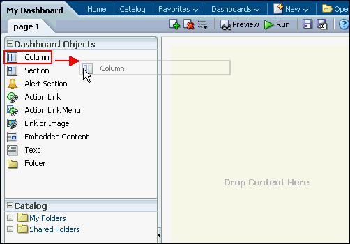 The Column object appears on the Page Layout pane. 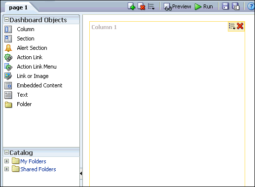 |
| 4 . | a. In the Catalog pane, navigate to the folder where you saved your analyses. 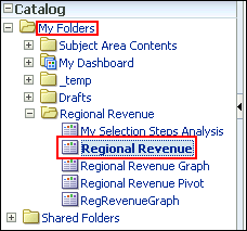 b. Drag the Regional Revenue analysis to Column 1.  Regional Revenue appears in the column. Observe that a Section is automatically created for you. You can also drag an analysis directly onto an empty Layout Pane without first creating a column. The Dashboard Builder automatically creates the column for you. You can then add sections automatically to that column by dragging analyses below the existing sections. 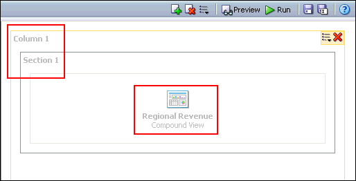 c. Click the Save icon (  ) to save the dashboard page and then click the Run icon ) to save the dashboard page and then click the Run icon  . .My Dashboard appears with the selected analysis Regional Revenue. 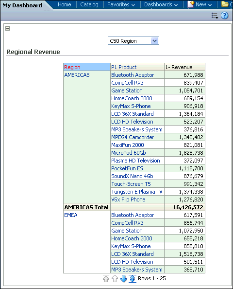 |
Creating a Dashboard
To create a new dashboard, perform the following steps:| 1 . |
Select New > Dashboard
in the global header.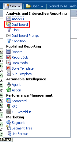 The New Dashboard dialog box appears. 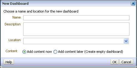 |
|---|---|
| 2 . | a. Enter Customer Detail in the name text box. Notice that you can also enter a description of your choice. b. Navigate to your Regional Revenue folder and select it as the Location. If you receive a warning message, click OK to close it. Note: If you save the dashboard in the Dashboards subfolder directly under the /Shared Folders/first level subfolder, the dashboard will be listed in the Dashboard menu on the global header. If you save it in a Dashboards subfolder at any other level (such as /Shared Folders/Sales/Eastern), it will not be listed. If you choose a folder in the Dashboards subfolder directly unde rthe /Shared Folders/first level subfolder in which no dashboards have been saved, a new Dashboards folder is automatically created for you. For example, if you choose a folder named /Shared Folders/Sales in which no dashboards have been saved, a new Dashboards folder is automatically created and the Location entry changes to /Shared Folders/Sales/Dashboards. A new Dashboards folder is not automatically created if you choose a folder at any other level. c. Accept the default to Add content now. The New Dashboard dialog box should look like this: 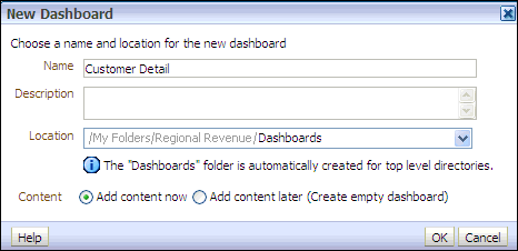 Observe that a Dashboards subfolder was automatically created inside the Regional Revenue folder. d. Click OK. The Dashboard Builder appears. 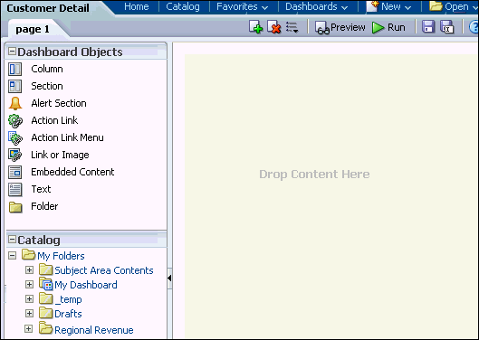 |
| 3 . | a. Navigate to the Customer Discounts by Region analysis and drag it from the Catalog to the Page Layout pane. b. Save and run the dashboard. The Customer Detail dashboard appears.  As mentioned above, because this dashboard was not created in a Dashboards subfolder directly under /Shared Folders/first level subfolder, the dashboard will not be listed in the Dashboard menu on the global header. To open the dashboard, navigate to it in the Catalog, or open it from the Recent list on the Home page or in the global header's Open menu. |
Editing a Dashboard
Dashboard editing, which is performed by using the Dashboard Builder (as explained above), is allowed for users with the appropriate privileges. In this subtopic, you enhance My Dashboard.To begin enhancing My Dashboard, perform the following steps:
| 1 . |
a. Select
Dashboards > My Dashboard. b. Click the Page Options icon (  ) and select Edit Dashboard. ) and select Edit Dashboard.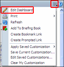 |
||||||||||||
|---|---|---|---|---|---|---|---|---|---|---|---|---|---|
| 2 . | Give the existing tabbed page a more meaningful name. Click the Tools button and select Dashboard Properties. 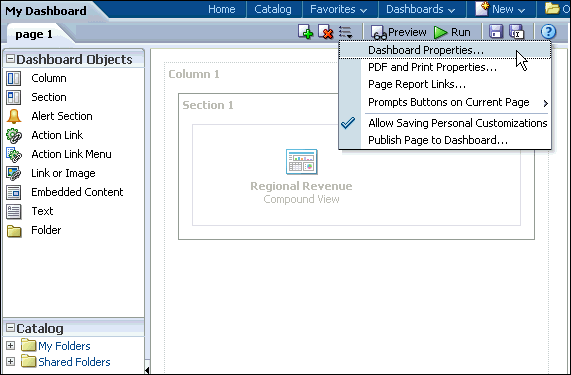 The Dashboard Properties dialog box appears.  From this dialog box, you can do the following:
|
||||||||||||
| 3 . | Select page 1 in the Dashboard Pages section. The Dashboard Page Control toolbar is enabled. Using the toolbar, you can do the following:
 |
||||||||||||
| 4 . | a. Click Rename icon ( ).The Rename dialog box appears. ).The Rename dialog box appears.b. Enter Regional Revenue in the Name text box and click OK.  The Dashboard Properties dialog box reappears with the new dashboard page name.  |
||||||||||||
| 5 . |
a. Click the Edit
icon for Dashboard Report
Links to set the report links at the dashboard level. Report
links can be set at the dashboard, dashboard page (click Page Options>
Page Report Links), or analysis level (click the properties icon for
the specific analysis within the Dashboard Builder and then select Report
Links).  b. Select the check boxes as indicated in the image below: c. Click OK and then click OK again to return to the Dashboard Builder. 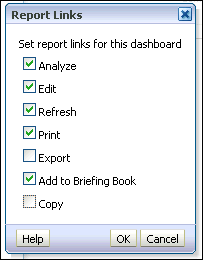 The Dashboard Builder should look like this:  |
||||||||||||
| 6 . | a. Click the Add Dashboard Page icon ( ). The Add Dashboard Page dialog box appears. ). The Add Dashboard Page dialog box appears.b. Name the dashboard page Customer Detail and click OK.  |
||||||||||||
| 7 . |
In the Catalog pane, navigate to the Customer
Discounts by Region analysis and drag it to the Page Layout pane
on the right. |
||||||||||||
| 8 . | Edit the properties of the column. a. Click the Column Properties icon. 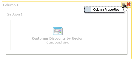 The Column Properties dialog box appears. 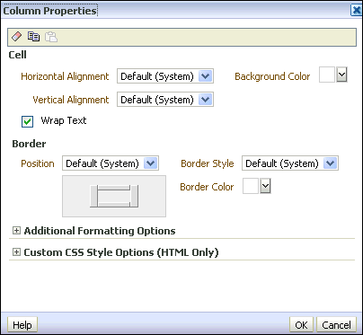 Using the Column Properties dialog box, you can change the appearance of the cells, border, width, height, and so on. You can also apply a custom style sheet. |
||||||||||||
| 9 . |
a. Select the drop-down list for Background
Color within the Cell area and choose
light green. Click OK,
then click OK again to close the Column Properties
dialog box. 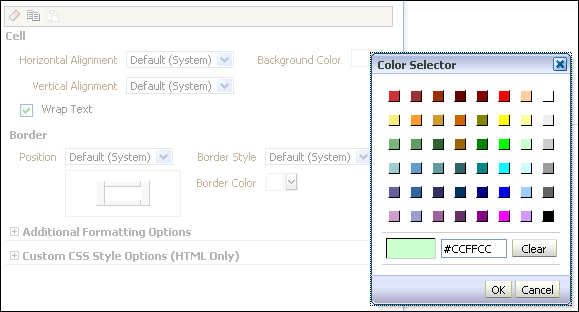 b. Click Preview to preview the dashboard. After previewing close the Window. 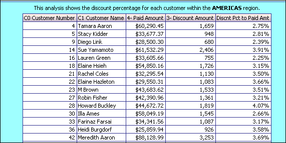 |
||||||||||||
| 10 . |
Edit the properties of the section. You use the Section Properties drop-down list to do numerous tasks:
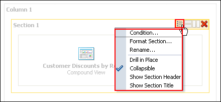 When you have more than one analysis within the section, you can also align the analyses by using the vertical and horizontal alignment icons.  a. Click the Properties drop-down list for the section and select Condition.  The Section Condition dialog box appears. 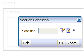 You use conditions to determine the following:
Click the New Condition icon (  ). The New Condition dialog box appears. Select Analysis
to base the new condition from the drop-down list.
). The New Condition dialog box appears. Select Analysis
to base the new condition from the drop-down list. 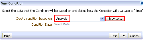 |
||||||||||||
| 11 . | Browse the Catalog and select the Customer Discounts by Region analysis.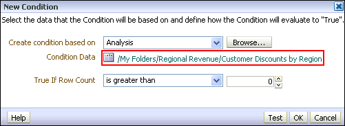 |
||||||||||||
| 12 . | a. In the "True If Row Count" drop-down list, select is less than and enter 25 in the text box to the right. The New Condition dialog box should look like this:  b. Click Test. Previously, your analysis returned more than 25 records. Therefore this test should evaluate to False. 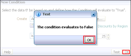 c. Your results are verified. Click OK. To further verify your results, then click OK and click OK again to return to the Dashboard Builder. Preview the dashboard page now.  The dashboard page is empty. All that appears within the dashboard page is the column color. d. Close the Preview window. Click the Properties drop-down list for the section and select Condition. The Section Condition dialog box appears. e. Click the More icon and select Remove Condition to remove the condition so that the section displays. 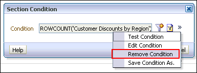 e. Click the OK. |
||||||||||||
| 13 . |
You will rename the section. a. Click Properties (within the section) > Rename. The Rename dialog box appears.  b. Enter Customer Discount Percentage in the text box.  c. Click OK. |
||||||||||||
| 14 . | a. Click Properties (within the section) > Show Section Title. 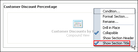 b. Preview the dashboard page once again to see your changes.  c. Save the dashboard. |
||||||||||||
| 15 . | Override the default dashboard report links at the analysis level. a. Click the Properties icon for the Customer Discounts by Region analysis, and select Report Links. 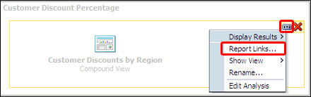 b. The Report Links dialog box appears. 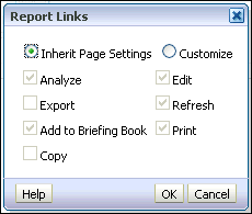 c. Select the Customize radio button and then select all check boxes. 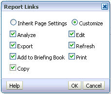 d. Click OK. e. Save and run the dashboard page. You are now able to export and copy this analysis from the dashboard.  |
||||||||||||
| 16 . |
a. Edit the dashboard in the Dashboard Builder again
and further edit the Customer Detail tabbed page. b. Edit the section properties for the analysis and select Drill in Place. Drilling allows you to view additional levels of detail for the specific column. Drill in Place means that the current browser is refreshed with the new data. To return to the previous view, simply click the back button on your browser. 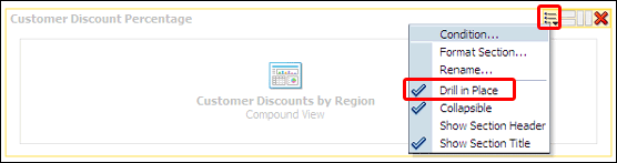 c. Save and run the dashboard page. |
||||||||||||
| 17 . |
a. Drill down on Customer Name, Diego Link. The Customer's Order Status column appears.  b. Drill down on the column header, R1 Order Status. The Order Number column R0 Order Key appears.  |
Saving a Customized Dashboard
To save a customized dashboard and set preferences, perform the following steps:|
1
. |
Create a personal, customized view of your dashboard page. Saved customizations
allow you to save and view dashboard pages in their current state with
your most frequently used or favorite choices for items such as filters,
prompts, column sorts, drills in analyses, and section expansion and
collapse. By saving customizations, you do not need to make these choices
manually each time you access the dashboard page. a. Select Page Options > Save Current Customizations.  b. The Save Current Customization dialog box appears. Name your customization Customer Order Status and click OK.  c. You can apply the saved customization to a dashboard page. Click Page Options > Apply Saved Customization > Customer Order Status. 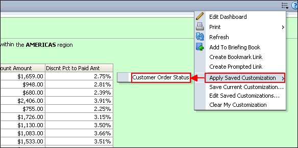 |
|---|
Prompting to Filter Analyses
A dashboard prompt is a special filter that filters analyses embedded in a dashboard. There are two various prompts and this topic discusses the Named and Inline Prompts. You will learn to create a Named Prompt in your dashboard.The prompt created at the dashboard level is called a Named prompt, because, the prompt is created outside of a specific dashboard and stored in the catalog as a prompt object, which can then be applied to any dashboard or dashboard page that contains the columns, which are specified in the prompt. It can filter one or any number of analyses embedded on the same dashboard page. You can create and save these named prompts to a private folder or a shared folder.
- A named prompt is interactive and will always appear on the dashboard page so that the user can prompt for different values without having to rerun the dashboard.
- A named prompt can also interact with selection steps. You can
specify a dashboard prompt to override a specific selection step.
The step will be processed against the dashboard column with the user-specified data values collected by the dashboard column prompt, whereas all other steps will be processed as originally specified.
Creating a Named Dashboard Prompt
Named prompts in the Catalog can be applied to any dashboard or dashboard page that contains the columns specified in the prompt.To create a named dashboard prompt, perform the following steps:
| 1 . |
Create a named dashboard prompt for region that specifically filters the data for APAC. Click New > Dashboard Prompt on the global header and then select the A- Sample Sales subject area.  The Definition pane appears. The Definition pane allows you to add, organize, and manage a named prompt's columns. You can use column prompts, image prompts (maps), currency prompts, and variable prompts. The Definition table lets you view high-level information about the prompt's columns. You can also use this table to select columns for editing or deleting, arrange the order in which the prompts appear to the user, or insert row or column breaks between prompt items. The Display pane is a preview pane that allows you to view the prompt's layout and design. 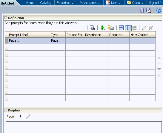 |
|---|---|
| 2 . |
a. In the Definition pane, click the New prompt icon ( ), and select Column Prompt. ), and select Column Prompt.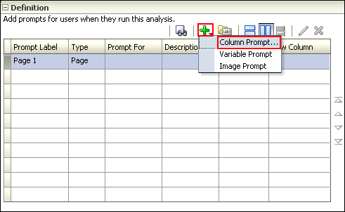 b. Select C50 Region as the column for the prompt, and click OK. 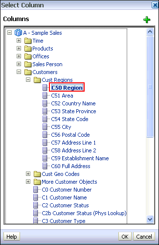 c. The New Prompt: C50 Region dialog box appears. The Prompt for Column field allows you to view information about the column that you selected as the prompt. This appears only for column prompts.  The Label text box allows you to enter a meaningful label that appears on the dashboard next to the prompt. Enter Select a Region: in the the Label text box (add a space following the colon). You can optionally enter a description. d. Select the operator. Accept the default, which is "is equal to / is in." This field is only for column prompts. e. The User Input field's drop-down list appears for column and variable prompts and provides you with the option to determine the User Input method for the user interface—in other words, the user will see one of the following: check boxes, radio buttons, a choice list, or a list box. You use this item in conjunction with the Choice List Values item to specify which data values appear for selection. For example, if you selected the User Input method of Choice List and the Choice List Values item of All Column Values, the user will select the prompt's data value from a list that contains all of the data values contained in the data source. Accept the default, Choice List. f. The Options section provides you with the opportunity to constrain values available for selection. Click the plus sign to expand the Options section. Because you selected Choice List for the User Input field, you must now indicate those values. Some of your choices include All Column Values, Specific Column Values (where you supply those values), SQL Results (choose a list of values based on a SQL statement), and so on. Accept the default, All Column Values. g. The series of check boxes allows you to restrict the amount of data returned. Select the Enable user to select multiple values, and Require user input check boxes. Allowing multiple selection of values lets you choose more than one value (region, for example), and requiring input forces you to enter at least one value. "Default selection" allows you to select an initial value, and "Set a variable" allows you to create a new variable that this column prompt will populate. Accept the default, None, for both of these fields. The New Prompt dialog box should look like this:  h. Click OK. |
| 3 . |
The prompt is added to the Definition pane. Save the prompt in the Regional Revenue folder as Region prompt.  |
| 4 . |
Test the prompt. Navigate to My Dashboard - Customer Detail and open it in the Dashboard builder. Recall that the "Customer Discounts by Region" analysis has a Narrative view associated with it that is specifically set to the value of Americas. Use Page Options > Edit Dashboard to open the Dashboard builder. Navigate to select Region Prompt from the catalog pane. 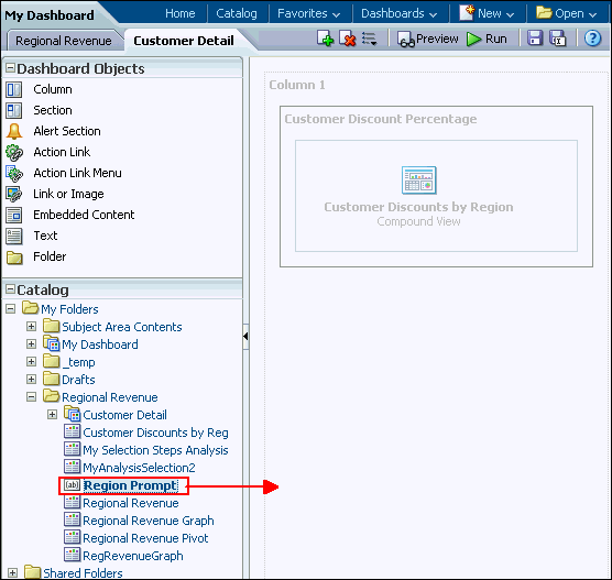 |
| 5 . |
Drag Region Prompt to
Column 1, above the "Customer Discounts by Region" analysis. 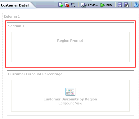 |
| 6 . |
Click the Region Prompt properties icon and select Scope
> Page. Scope determines whether the prompt applies to the
entire dashboard or just this page.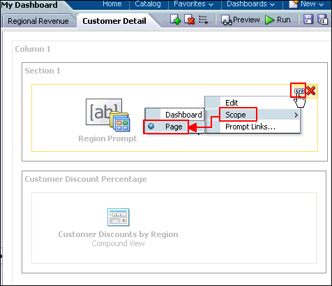 |
| 7 . |
a. Save and run the dashboard. Initially,
the filters for the analysis that you created earlier are assumed; that
is, the analysis is filtered for Americas region.  b. Select APAC from your dashboard prompt. 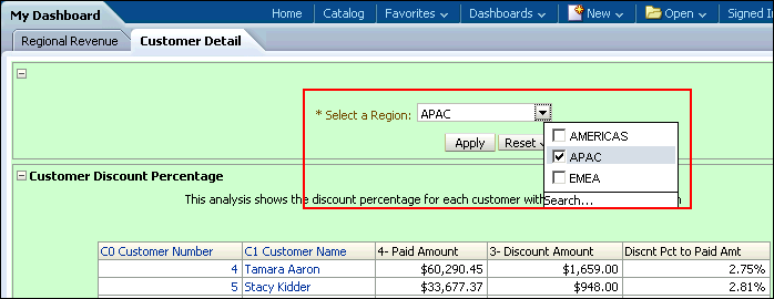 c. Click Apply. The region value changes for this page. d. Observe the change in the region in the dashboard display: 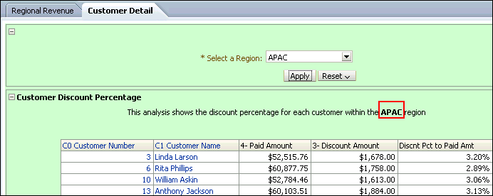 You can try selecting other values in the prompt. Then click Apply to rerun the dashboard prompt. |
Managing Prompts
You can now manage prompts with different options.- You can choose to show or hide a prompt's apply and reset buttons. If the designer chooses to hide the apply button, then the specified prompt value is immediately applied to the dashboard or analysis.
- The prompt Reset button now provides three reset options: Reset to last applied values, Reset to default values, and Clear All.
- The row-based layout prompt option is added to the prompt editor's "Definition pane". You can now display your prompts in a row or in a column.
|
1
. |
Create an analysis with filters. a. Create an anlysis with the following columns:
 b. Create filter for T05 Per Name Year and D50 Region. Click the More link for T05 Per Name Year. In the New Filter dialog box, select is prompted as the operators. Click OK. 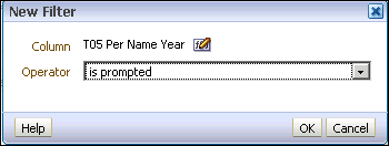 c. Similarly, create a filter for D50 Region. Your analysis should look like this: 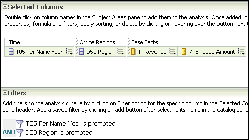 d. Save the analysis as My Regional Stats. |
||||||||||
|---|---|---|---|---|---|---|---|---|---|---|---|
|
2
. |
Create a dashboard prompt for year and region. Click New > Dashboard Prompt on the global header and then select the A - Sample Sales subject area. |
||||||||||
|
3
. |
a. In the Definition pane, click the New
prompt icon (),
and select Column Prompt. b. Select T05 Per Name Year from the Time folder, and click OK.  |
||||||||||
|
4
. |
In the New Prompt dialog box, enter the label as "Year: ".
Click OK. |
||||||||||
|
5
. |
The prompt is added to the Definition table. |
||||||||||
|
6
. |
Similarly, add another prompt for D05 Region. In the New Filter
dialog box, label the prompt as "Region: ". You should now
have two prompts in the Definition table.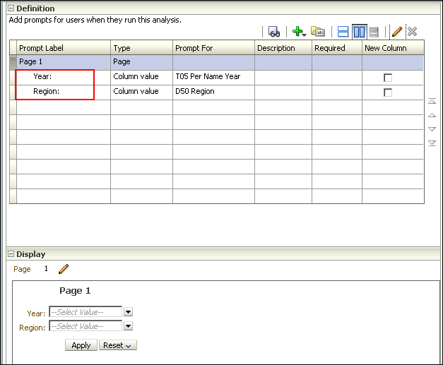 |
||||||||||
|
7
. |
Click the row-based layout at the top and notice that the prompts are
laid out horizontally in the Display section.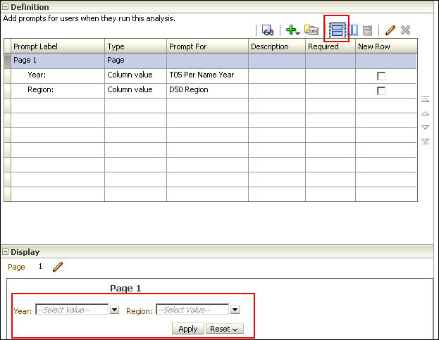 |
||||||||||
|
8
. |
Save the prompt in the Regional Revenue folder as
My Prompt. |
||||||||||
|
9
. |
Select Page 1 row in the Definition table and click the pencil
icon to edit the page properties.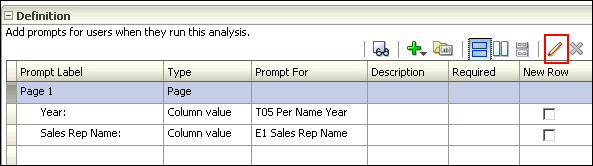 |
||||||||||
|
10
. |
In the Edit Page Settings dialog box, change Prompt Display to Place
label above prompt. Deselect the Show Apply button and Show Reset
button check boxes. The Edit Page Settings dialog box should look like
this: Click OK. Observe that the buttons have been removed from the Display section. Save the prompt. 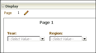 |
||||||||||
|
11
. |
Open My Dashboard and add a new page. Use Page
Options > Edit Dashboard to open the Dashboard builder.
Click the Add Dashboard page icon. 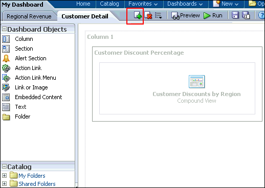 |
||||||||||
|
12
. |
In the Add Dashboard Page dialog box, enter Region Stats as
the page name and click OK.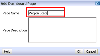
|
||||||||||
|
13
. |
In the new page, drag My Prompt
and My Region Stats from My Folders>Regional Revenue folder,
to the dasboard page.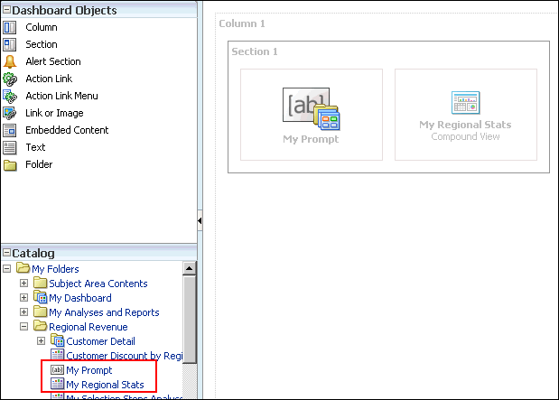 |
||||||||||
|
14
. |
Save My Dashboard and click Run. The dashboard appears.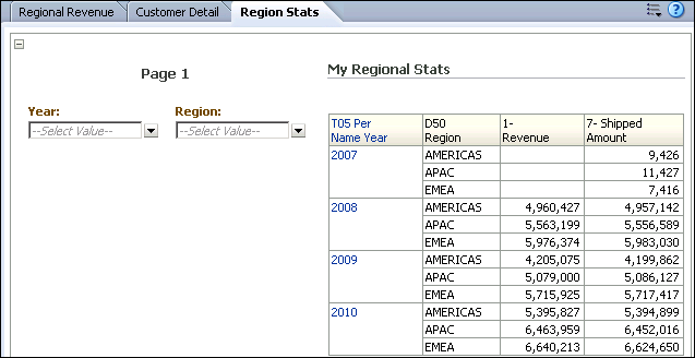 |
||||||||||
|
15
. |
Select 2009 as the year and click anywhere on the dashboard.
The query runs immediately and returns with data for only 2009. |
||||||||||
|
16
. |
Select EMEA as the Region and click any where on the dashboard.
The dashboard refreshes with Year as 2009 and Region as EMEA. |
||||||||||
|
17
. |
Select Page Options>Edit Dashboard. Click the Tools icon
and select Prompts Buttons on Current Page>Apply Buttons>Show
All Apply Buttons.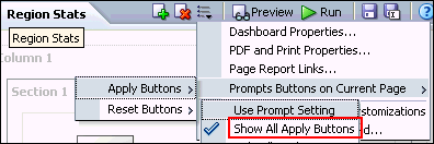 |
||||||||||
|
18
. |
Click the Tools icon and select Prompts Buttons on
Current Page>Reset Buttons>Show All Reset Buttons.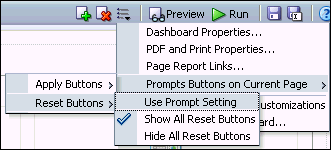 |
||||||||||
|
19
. |
Save the dashboard and run it again. This time both the Apply
and Reset buttons are displayed.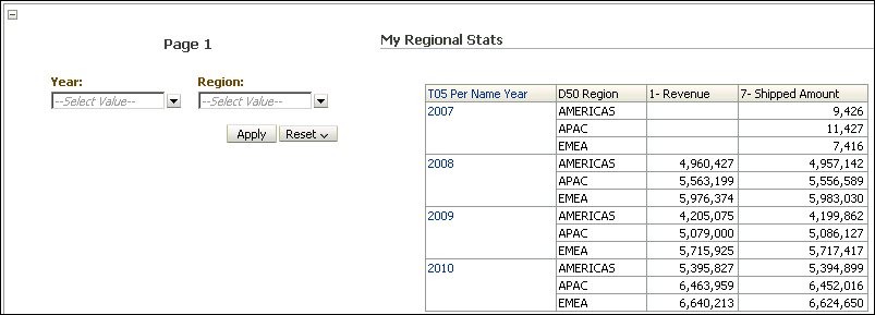 |
Using a Presentation Variable
A presentation variable can be created as part of the process for creating a column prompt or a variable prompt. When the presentation varaible is part of a column prompt, it is associated with a specific column and takes on that column's value. It is part of a variable prompt, you define the values that the prompt can have as it is not associated with any specific column. The name and value of the presentation variable is determined by the user when it is initially declared or when it is referenced in the analysis, dashboard, or agent.Note: You have already created and used a presentation variable when you added a Narrative view to your analysis.
To add a presentation variable using a variable prompt, perform the following steps:
| 1 . |
Create a new variable dashboard prompt that creates a Sales Representative
presentation variable. a. Click New > Dashboard Prompt and select Sample Sales as the subject area. |
|---|---|
| 2 . |
Click New
> Variable Prompt.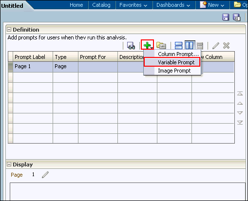 The New Prompt dialog box appears. 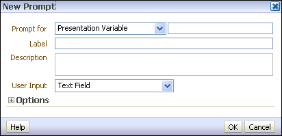 |
| 3 . |
a. Accept Presentation
Variable as the default prompt type. b. In the text box to the right of the drop-down list for the prompt type, enter the same variable that you entered in the Static Text editor, VarSalesRep. c. Enter Sales Representative Name: in the Label text box. 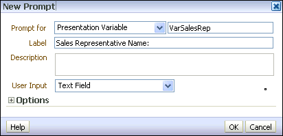 d. Select Choice List for User Input. 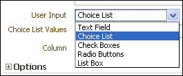 e. Select All Column Values for Choice List Values. 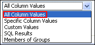 The dialog box should look like this: 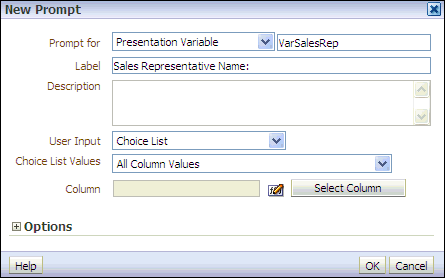 |
| 4 . |
a. Click Select Column and, in the
Select Column dialog box, select Sales Person > E1 Sales
Rep Name.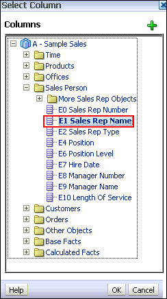 b. Click OK. The dialog box should look like this:  Expand the Options section. |
| 5 . |
Select Specific Value from the "Default selection" drop-down list.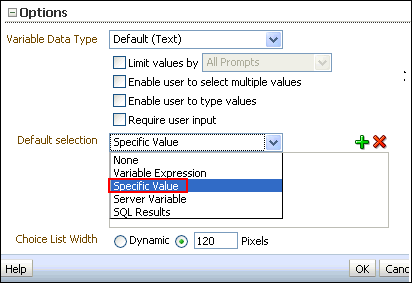 Click the Select Values icon. 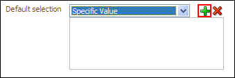 |
| 6 . |
In the Select Values dialog box, select Angela
Richards and then, click OK.  |
| 7 . |
The New Prompt dialog box should look like this: Click OK. The newly created variable prompt is displayed in the prompts definition list. 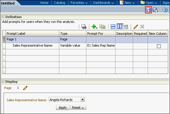 |
| 8 . |
Save the prompt as SalesRep
Variable Prompt in your Regional
Revenue folder.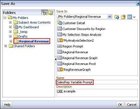 |
| 9 . |
Click the Preview icon ( )
to preview the prompt. )
to preview the prompt.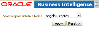 Close the Preview window. |
Using a Presentation Variable in a Static Text View
Create an analysis that uses the VarSalesRep presentation variable in a Static Text view and in a Filter.A Static Text view adds static text in the results.
| 1. |
Create an analysis by selecting the following
columns:
 |
|---|---|
| 2 . |
Add ascending column sorts in this sequence: C50
Region, C52 Country Name,
and E1 Sales Rep Nameas shown below: 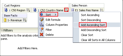 The Criteria tabbed page should look like this after adding the sorts: 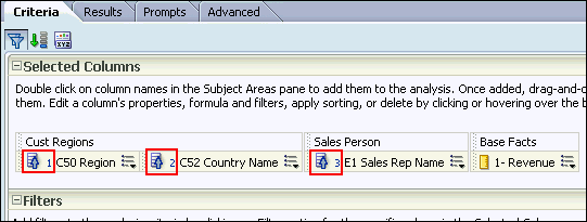 |
| 3 . |
Select the Results tabbed page. |
| 4 . |
Select New View > Other Views > Static Text. 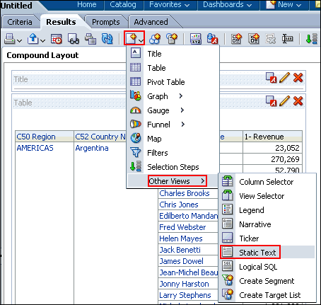 |
| 5 . |
Move the Static Text view above the Table view.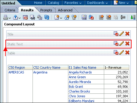 Click the Edit View icon on the Static Text view. The Static Text editor appears. 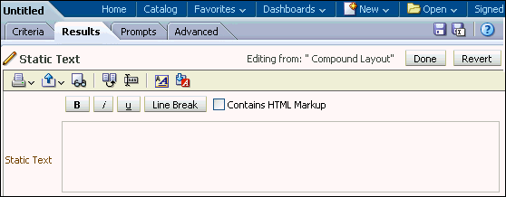 |
| 6 . |
In the Static Text editor, reference the VarSalesRep
variable. Enter the following syntax in the Static
Text pane: This analysis is
for the Sales Rep @{VarSalesRep}. The syntax for referencing a Presentation variable is as follows:
@{variables.variablename}[format]{defaultvalue}
or @{scope.variables['variablename']}
Where: 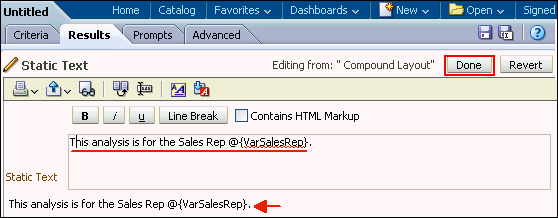 Observe that your entry is previewed below the Static Text text box. Click Done. |
| 7 . |
Save your analysis as Sales
Reps by Region and Country.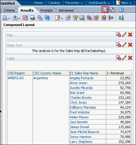 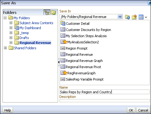 Your analysis should look like this: 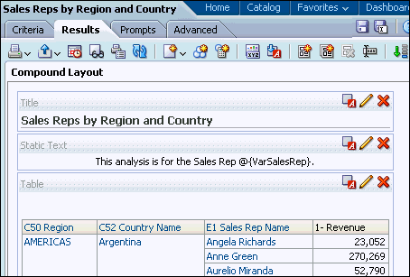 |
| 8 . |
a. Select the Criteria tabbed page. b. In the Filters pane, click the Create a Filter icon and select "Sales Person "."E1 Sales Rep Name ". 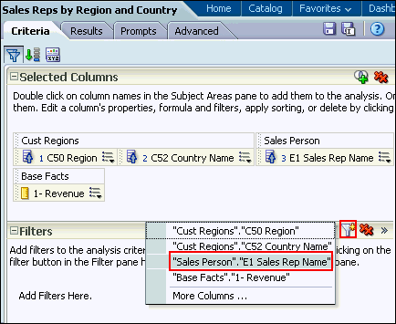 |
| 9 . |
a. In the New Filter dialog box, click Add
More Options and select Presentation Variable. b. In the Variable Expr field, enter the variable name, VarSalesRep. Notice that you can also specify a default for the variable, but in this case the default is driven by the variable prompt, which is set to default to "Angela Richards". 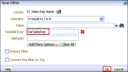 c. Click OK. The filter should look like this:  |
| 10 . |
Select the Results tabbed page. Because the variable
dashboard prompt has not been run, the VarSalesRep presentation variable
has not been populated with a value. Because of this, no results from
the analysis meet the filter requirement. Save the analysis. |
|
11
. |
Add the analysis Sales Reps by Region and Country and the newly created variable prompt to the Customer Detail dashboard. |
| 12 . |
Open the dashboard Customer Detail from the Regional Revenue folder,
then click Page Options > Edit Dashboard. |
| 13 . |
Add a new column next to Column 1, and
then navigate to the Sales Reps
by Region and Country analysis and drag it to the new column. |
| 14 . |
Navigate to SalesRep Variable Prompt
in the catalog pane, and drag the prompt above the Sales
Reps by Region and Country analysis. Save the dashboard and run
it. The Dashboard view looks like this: 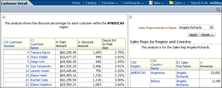 |
| 15 . |
Click the Collapse icon for the first column to minimize
it. 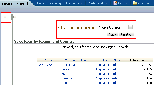 The dashboard runs and the variable dashboard prompt is preset to the default value, Angela Richards, which in turn appears in the Static Text view as expected and is used to filter the embedded analysis results. The value of a presentation variable is populated by the variable prompt. That is, each time you select a value in the variable prompt, the value of the presentation variable is set to that value. |
Click the drop-down list for the dashboard prompt, and select Chris
Jones.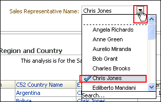 Click Apply. The dashboard displays the presentation variable as Chris Jones. 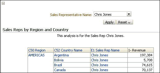 This concludes the topic of Presentation Variables and Filters. |
No comments:
Post a Comment